
It’s not often I find a hockey identity I really like. Not because the NHL has more bad designs than any other league, I’m just not that big of a fan of the sport (Or any other sport outside of football, really). But, instead of that being a weakness for me when critiquing a hockey identity design, I think it’s an advantage because I’m not jaded by the “rules” and cliché’s of the sport’s own aesthetic. It allows me to see the design purely without any emotional attachment or idea for what hockey design “should be”. The Dallas Stars’ new identity makes me care about hockey. This identity I notice and am excited about.
Color
From what I know of the Stars, they’ve always included green, gold, and black in the identity. Replacing gold with silver definitely will be a bit of a shock to Stars fans, and will make the design at first seem unfamiliar. The fresh Victory Green and Silver palette instantly signals a new era in the franchise. It’s very bold and energetic and the team should really feel big and fast when seen on the ice. There were about 5 different color palettes being considered for this, with blue and silver (an impending disaster) being highly favored by the team.
Type
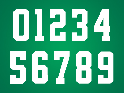 |
| from dribbble.com, Andrew Sterlachini: LINK |

After looking through so many terrible number fonts and type systems from Nike in college football and the NFL this year, it’s refreshing to see a font system done so beautifully. The numbers are a slight variation on a standard block, but it’s the best typography I’ve seen in sports this year. It’s consistent from one character to the next, yet the variation makes each one unique enough. Notice the 6 and 9; they’re not mirrored, but individually designed to be it’s own digit. I fucking LOVE these numbers!
The word mark isn’t as good. It feels skewed too much and the heavily beveled “STARS” feels disconnected from the city name, which was left untouched. With no containing shape or element to otherwise bring the two together it’s left looking a bit weak. It’s also the only logo that dosent include black.
Logos
Overall the new primary logo is a seriously cool and well executed design. I wish there was more of an emphasis on green with maybe a silver key stroke, but it’s a logo that looks great on the front of a jersey or a hat, or t-shirt, or whatever you put it on. It has sort of an old sheriff’s badge look to it too, weather that’s intentional or not I don’t know, but it definitely says “Texas sports team”.
I love roundels and the secondary is a solid effort. I’m not sure about the primary being included inside the center though. I think that’s maybe a missed opportunity to do something different there. The primary D-Star as it is dosen’t really have a strong presence inside the circle, it has to be small to fit inside and the lack of it’s strokes makes it seem odd when paired next to the true primary logo. I really prefer the “Dallas Stars” type like this, un-skewed and un-beveled, but again it lacks some consistency when you match it to the true word mark. Overall though, it does look good on the shoulders of the jersey.
Counting the word mark, the tertiary is actually the 4thlogo in the family and weather it’s needed, I’m not sure. It’s a cheesy, cliché concept (state shape) that really gets played out in Texas themed logos. Again we see the primary used here in an awkward space making the logo heavy on the bottom and the tangent on the top point of the star touching the top of the state’s outline makes me cringe. Instead of forcing the primary into the space it wedges in best, I’d rather see it centered within the state shape, or even another idea here. A monogram, or single star, or put the roundel around it. Despite it’s flaws and terribly cliché concept, it’s still a likeable logo and I think Stars fans will really dig it.
Uniforms

The uniform is unique in color and type, but features traditional hockey striping. It works really well though, because as detailed as the logos are I think it was a good idea for the uniforms to be very simple and let that great green color and new logos be the hero of the design.
I know it’s a fairly common style, but I don’t like the green shoulders on the white jersey. It looks like the pointless color blocking you see a lot in college football uniforms. Personally, I’d rather see the jersey be all white (outside of the stripes). The striping on the white jersey and socks is really great. I love the alternating color and wish the same would have been done on the green. What confuses me most is the shorts are the same for both sets. They match the green jersey but looks too different with the white. It’s not a big deal but I’m not sure why they designed a jersey and socks stripes to be different on each set but wouldn’t do the same with the shorts.
One slight complaint is the total lack of detail outside of the logos. All of the uniforms elements are solid, flat color blocks, but each logo is so intricate there is some disconnect there. Like I said before, they didn’t need to do a lot with the uniforms, but I’d like to see a bit more cohesiveness between logos and uniform elements. Maybe some silver lining on the stripes or the numbers? It just lacks some detail that would visually tie everything together.
It’s not a perfect identity, but there is so much here to love. The color is my favorite part. The package as a whole is so good, I almost want to be a Stars fan. I probably won’t watch many games, but I might have to buy a t-shirt or two.
