Dribbble
bucketMost design trends come and go quickly, while others can stand long enough to define a movement. And in the midst of the movement, what is going on
now becomes modern design. of course, there can be multiple movements going on at the same time and modern design becomes a collection of these movements. And certainly any trend that is strong enough to be a large and important movement has the ability to come back after it has died off. “what is old is new again” applies to art and design with nearly every generation.
I think any current trends in creative arts or culture has an effect on the ones that follow. Often, it will inspire something that is very contrasting. In the late 80s, “grunge” music was inspired very much by the LA hair metal scene. It was a reaction to the status quo of glitzy, glammed-out, girly men. the 60s hippy culture of love and peace a reaction to war. In the early 2000s web 2.0 was the current design standard with its shiny bells and whistles, and now minimalism is very large, which focuses on using only what is necessary and lots of space. There seems to always be a group of people who enjoy doing the opposite of everyone else in order to stand out, and very often, progress the medium forward.
Which brings me to the reaction of minimalism that I call “vintage-modernism”.
Over the last year or two, it has exploded into the mainstream trend. Vintage-modernism is everywhere. You cant go through a single page of dribbble.com and not see it. it draws inspiration mainly from minimalism, grunge, art deco, and mid 20th century graphic design. some designers are also pulling typography inspiration from much older movements, such as medieval blackletter or art nuevo. the basic style is self explanatory by name. taking modern design elements and blending with vintage elements. A very large percentage of these designs feature:
Texture – subtle grunge for a worn or old effect. old paper is popular too, but the main gist here is to rough up the edges to make the design looked used or old.
retro colors - bold, but not highly saturated. remember we're going for a faded aged look here. retro complimentary colors are popular, think 1950s-1970s, but also more contemporary palettes can be found like black, grey, and red.
type - modern and/or vintage. tall Grotesque san-serifs, brush scripts, and slab serifs are the main ones. but, this element is widely varied. sometimes you will see slim modern serif fonts used as well. sometimes blackletter fonts. there is usually a high contrast in the combination of fonts such as a slab serif paired with a brush script. common to find 3 or more fonts in one design. solid drop shadows, strokes, and middle knock outs (lines going through the letters) are very common. this can also be the best part of this style as there are some very interesting type treatments being used.
shape - the circle is by far the most common shape. stars are common and so are shapes that resemble badges or seals. pointy banner shapes will often accompany a logo.
thick lines - outlining type or shape. 2 strokes of color on an element is common.
form - flat shapes, solid color blocks. the large color areas often have texture.
my feelings for this style are mixed because I feel I was ahead of the curve on this movement, developing my style to be this very thing, before I was aware it was even happening. I designed my personal identity in the summer of 2009 and it is based on many of those principals I listed above.
I designed a logo summer of 2010 that at the time I thought was totally unique, now is a standard style.
Yet, I had no influence on this movement at all. My presence is very small in the design world. If I were not a designer, vintage-modernism still would have happened without me, and now I only appear to be a follower of a trend.
That’s why im conflicted. Ive always been a bit rebellious. Doing the opposite of everyone else. My style was developing in response to what was the norm and now that “my style” is the norm I want to change again and go in another direction! But my designer/artist fantasy is to be a part of an important movement; Living in a city with other great creatives and influencing the world with our own original style. What it must have been like to be in the Renaissance with Leonardo and Raphael, or Paris in the 1920s with Picasso and Dali, or part of Bauhaus, or even in a Seattle band during the 90s grunge era.
So, what do I do? Change again and try to be an influence in the next movement? Forget about having my own style? "dont be original just be good". Or join the gang and continue to master the vintage-modernism style that I love, but will surely die off?
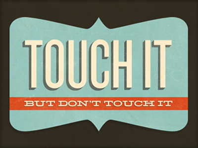
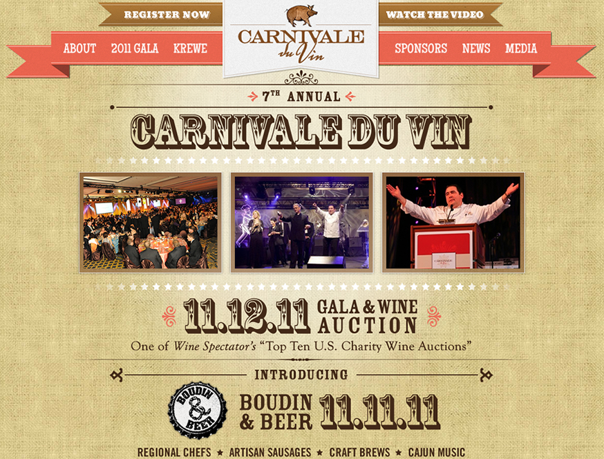
below are some shots of the style mostly pulled from dribbble.com. i like using dribbble examples because its a great barometer of whats going on now.
EDIT: also found this article from Smashingmagazine.com written in Oct. 2008 -
click here to readAnother article from Smashing, March 2012 -
click here to readEDIT 2: great article from
webdesigntuts on vintage modernism
heres a Pintrest board with lots of examples
view here






 It's a beautiful day in the Richmond District, our new bike corral is in full use. We're here for all of your 4th of July reading and music listening needs, so stop on by and pick up something to read at the BBQ.