I’ve paid very close attention to sports uniform design for the last 5 years. Specifically, college and pro football. This year has been one of the most disappointing seasons for football uniform and logo design (actually, just the NFL in the logo department). It seems it’s been mostly about recycling ideas and copying what others have done before rather than creating something new. Although there are one or two new things for 2013, It largely seems like schools and designers are running out of ideas. But I think what lies ahead can be very promising, if someone takes advantage of it.
The Possible Future of Sports Uniforms
I’ve paid very close attention to sports uniform design for the last 5 years. Specifically, college and pro football. This year has been one of the most disappointing seasons for football uniform and logo design (actually, just the NFL in the logo department). It seems it’s been mostly about recycling ideas and copying what others have done before rather than creating something new. Although there are one or two new things for 2013, It largely seems like schools and designers are running out of ideas. But I think what lies ahead can be very promising, if someone takes advantage of it.
Socks – Socks are a growing niche for apparel manufactures as some are reporting a 35% increase in sock sales within the last year. This growing trend with the often overlooked and unexplored area of sock design in sports uniforms makes for a great opportunity for a school and designer to take advantage of. Especially for UnderArmor, Nike, and adidas, where everything they do is to direct you back to shoes. Because the sock/shoe combo is such a great hook in stores now, they do offer socks that will combo with your new pair of kicks. But the attention could be driven more towards that if they took advantage of a sock design for one of their major college clients.
Everyone is racing for the helmet now, and sublimated patterns and unique designs within numbers and jersey sleeves have been around for a few years. The unexplored ankle area could be one that these companies will compete for soon. Under Armor is experimenting with sublimated sock designs now for purchase in stores. Don’t be surprised if Maryland football rolls out with a school specific pattern on their socks ala’ the popular pattern-within-numbers trend. Oh, but let it be known I though of it first 3 years ago :)
Cooling Technology – I’m not sure if this will make it’s way into the jersey and pants fabric for football because it’s a cold weather sport. Baseball and basketball could be different stories though. But what I envision for under shirts, sweatbands, arm sleeves, skull caps, helmet liners, and headbands is being made from self cooling fabrics.
Conventional wisdom says that to cool the body, you need to move air and have ventilation; something modern jerseys and helmets are designed to do. But with these new materials, companies are saying cooling comes from conduction, where the material cools the skin. Basically, when the fabric gets wet, it gets cold.
Adidas is already in the game with Climachill, which will hit the marketplace in spring 2014. It acts like a mesh, using titanium cooling fibers and aluminum silver dots that cool the body. A company I’m more interested in is Dr Cools (drcoolrecovery.com) who also has material hitting the marketplace in spring 2014. Their biggest piece right now is a hoodie which is endorsed by Reggie Bush, using EnduraCool technology. It does the same thing as adidas’ version in principle; when the material gets wet from sweat, it gets cold. Another company doing the same but I know very little about is NEXAR.
Helmet Design - We have seen matte helmet finishes and matte vinyl graphics before. I have yet to see matte properly combined with a gloss finish. I have to believe though, that it’s only a matter of time before the muscle car influence hits college football where a matte decal is set on a gloss finish (it’s always the other way around). I think it would be an excellent combo for the ever popular black-on-black look, as seen below.
There’s also a whole world of vinyl graphics that the football game hasn’t seen yet. Oregon has used fluorescents on their helmets, and a few others have used chrome-color on theirs. But we’ve only touched the tip of the iceberg. There’s so many other fluorescent, pearlescent, reflective, metal flake, chrome-color, engine turn, gloss, matte, satin, and translucent options available that I’m not even sure if Nike, UA, and adidas even know about. It dosent have to be a gaudy, in-your-face application, just imagine a helmet with a matte-chrome (kind of like brushed aluminum) finish with a 1 color logo in any of the previously mentioned materials. There is plenty of original ideas waiting to be discovered.
It would be great to see any of these ideas actually used in uniform design, but like all the other trends and advances, it has potential to be abused. There's nothing wrong with gradients and matte finishes and such, but the way they are used most of the time is horrible. Most critics and sideline designers want to put all the blame on the designers, Nike, adidas, etc. But the clients are the ones getting what they want in the end. They're the ones making the final calls, and if they're already doing a shit job of handling what's available to them now, then they'll probably do a shit job of handling everything else to come after it. I like to stay positive though. Can someone just please do a matte black decal on gloss black helmet for me!?!?
The Stars at Night, Are Beveled and Bright: Dallas Stars 2013 Identity
It’s not often I find a hockey identity I really like. Not because the NHL has more bad designs than any other league, I’m just not that big of a fan of the sport (Or any other sport outside of football, really). But, instead of that being a weakness for me when critiquing a hockey identity design, I think it’s an advantage because I’m not jaded by the “rules” and cliché’s of the sport’s own aesthetic. It allows me to see the design purely without any emotional attachment or idea for what hockey design “should be”. The Dallas Stars’ new identity makes me care about hockey. This identity I notice and am excited about.
Color
From what I know of the Stars, they’ve always included green, gold, and black in the identity. Replacing gold with silver definitely will be a bit of a shock to Stars fans, and will make the design at first seem unfamiliar. The fresh Victory Green and Silver palette instantly signals a new era in the franchise. It’s very bold and energetic and the team should really feel big and fast when seen on the ice. There were about 5 different color palettes being considered for this, with blue and silver (an impending disaster) being highly favored by the team.
Type
| from dribbble.com, Andrew Sterlachini: LINK |
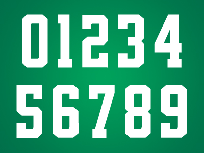
After looking through so many terrible number fonts and type systems from Nike in college football and the NFL this year, it’s refreshing to see a font system done so beautifully. The numbers are a slight variation on a standard block, but it’s the best typography I’ve seen in sports this year. It’s consistent from one character to the next, yet the variation makes each one unique enough. Notice the 6 and 9; they’re not mirrored, but individually designed to be it’s own digit. I fucking LOVE these numbers!
The word mark isn’t as good. It feels skewed too much and the heavily beveled “STARS” feels disconnected from the city name, which was left untouched. With no containing shape or element to otherwise bring the two together it’s left looking a bit weak. It’s also the only logo that dosent include black.
Logos
Overall the new primary logo is a seriously cool and well executed design. I wish there was more of an emphasis on green with maybe a silver key stroke, but it’s a logo that looks great on the front of a jersey or a hat, or t-shirt, or whatever you put it on. It has sort of an old sheriff’s badge look to it too, weather that’s intentional or not I don’t know, but it definitely says “Texas sports team”.
I love roundels and the secondary is a solid effort. I’m not sure about the primary being included inside the center though. I think that’s maybe a missed opportunity to do something different there. The primary D-Star as it is dosen’t really have a strong presence inside the circle, it has to be small to fit inside and the lack of it’s strokes makes it seem odd when paired next to the true primary logo. I really prefer the “Dallas Stars” type like this, un-skewed and un-beveled, but again it lacks some consistency when you match it to the true word mark. Overall though, it does look good on the shoulders of the jersey.
Counting the word mark, the tertiary is actually the 4thlogo in the family and weather it’s needed, I’m not sure. It’s a cheesy, cliché concept (state shape) that really gets played out in Texas themed logos. Again we see the primary used here in an awkward space making the logo heavy on the bottom and the tangent on the top point of the star touching the top of the state’s outline makes me cringe. Instead of forcing the primary into the space it wedges in best, I’d rather see it centered within the state shape, or even another idea here. A monogram, or single star, or put the roundel around it. Despite it’s flaws and terribly cliché concept, it’s still a likeable logo and I think Stars fans will really dig it.
Uniforms
The uniform is unique in color and type, but features traditional hockey striping. It works really well though, because as detailed as the logos are I think it was a good idea for the uniforms to be very simple and let that great green color and new logos be the hero of the design.
I know it’s a fairly common style, but I don’t like the green shoulders on the white jersey. It looks like the pointless color blocking you see a lot in college football uniforms. Personally, I’d rather see the jersey be all white (outside of the stripes). The striping on the white jersey and socks is really great. I love the alternating color and wish the same would have been done on the green. What confuses me most is the shorts are the same for both sets. They match the green jersey but looks too different with the white. It’s not a big deal but I’m not sure why they designed a jersey and socks stripes to be different on each set but wouldn’t do the same with the shorts.
One slight complaint is the total lack of detail outside of the logos. All of the uniforms elements are solid, flat color blocks, but each logo is so intricate there is some disconnect there. Like I said before, they didn’t need to do a lot with the uniforms, but I’d like to see a bit more cohesiveness between logos and uniform elements. Maybe some silver lining on the stripes or the numbers? It just lacks some detail that would visually tie everything together.
It’s not a perfect identity, but there is so much here to love. The color is my favorite part. The package as a whole is so good, I almost want to be a Stars fan. I probably won’t watch many games, but I might have to buy a t-shirt or two.
Norsemen In Purple Satin: 2013 Minnesota Vikings
When the Vikings released their slightly updated Norseman logo, it was a clear sign of the direction they were going to go with the new uniforms. A modern-retro design ala' Buffalo Bills. Where the Bills went more traditional, the Vikings went more for the future. Of the 3 new NFL uniforms this year, this is the one with the strongest execution.
The helmet has a satin finish which makes them the 2nd NFL team (Seattle the 1st) to feature a satin primary shell. I really like it with modern uniforms especially, where the new materials being used for jerseys and pants have a satin or matte finish. (I hope the shiny uniform materials stay away in the future, that silliness should have died with disco.) It definitely has a rugged feel to it, or as Jared Allen put it "Looks like we're playin' a man's game".
The horns got a bit of an adjustment and the best I can tell, they're just larger. Usually, a good thing but what we're seeing on the initial pieces is a tangent purposefully created where the horn tips touch in the back. Major points taken away for such an obvious visual tension, but hopefully they wont be that way once the season starts. It's strange to see the Vikings use a Revo Speed for showing off the new design. I don't think they should have adjusted the horn design just for this shell, it's just one option in a vast sea of helmets, but it's the one where they have to cut the decal to go over the vent.
People have flipped out over the use of a black face mask, but I think it's the perfect choice. Remember, this team is more forward thinking than the Bills, and black works very well as a modern neutral color. If it were grey, it would have a vintage connotation, and with the contrast would be a distraction, where the black is very subtle. There's also black in the horn and the base color for their cleats is black. So why not purple? If it were, then it would be a gloss finish and if there's a quick way to make a helmet look cheap and tacky it's mixing 2 finishes of the same color. So why not a satin mask finish? well that could be possible, I don't know what that process is like, but it hasnt been done before, so asking for that right now is a stretch. Why not white? Again, contrast. I dont like the mask to attract your eye and be the focus of the design. White also makes the bars appear larger, which makes it worse. Black was the way to go.
I think they started with the old Northwestern stripe design and used that to carve something new. Blending that with the sail of a ship idea turns out to be a really nice stripe. If there's one complaint i have there it's that there's not enough space between the 2 colors in the stripe. It's even worse on the white jersey where yellow and white meet each other. The stripes are sewn onto the jersey too, which the Bill's should take note of.
Per usual, Nike fails on the number font development. They are consistant though; consistently bad. I don't think a single number (either single or double digit) looks attractive at all. It's so odd to see one digit with the spurs and another next to it with none. If they left those spurs off, the whole uniform would benefit from it. It becomes a focal point of the uniform for it's oddness.
The pants stripe is one of my favorite details of the uniform, where you can see how they might have started with a Northwestern stripe. At the very least it looks like a nice evolution from that traditional design and give a sense of forward motion. I don't think anyone is aware that socks can have stripes on them. I would love to see the pants stripe carried over into the socks here.
The uniform is so close to being so excellent, but the number font keeps it from being so. It's definitely better than the Seahawks' and Dolphins' but it's not much consolation being the 3rd worse in the league. The helmet, if they fix the application of the horns, will be one of my favorites. Satin purple just looks so sweet and tough. I doubt they keep the finish forever, but damn, it's going to be nice having it around while it's here. Grade: B
Laces Out, Dan!: 2013 Miami Dolphins
The Dolphins' logo updates scream "cruise line" and not surprisingly, the new uniforms complete that look. This is sort of another modern-retro direction where they pulled an orange and aqua that are very similar to the ones they wore in the 60s and 70s, but all the other elements are completely new for Miami. Those new (old?) colors are all absolutely gorgeous! Whether isolated or used together, the orange, aqua, navy, and white make for one of my favorite color palettes in sports. My one concern though, is that it might be a bit feminine. Florida natives will probably have no fears about sporting those colors, but fans from the rest of the country might find them too "soft".
A trend in the 1980s, that has come back strong in the last 2 years, is white face mask on white helmets. The Dolphins are the first NFL team to jump on it and I actually really like this look. It dosen't date the helmet to the 80s in my mind, it looks really fresh and clean. The most identifiable element of their identity has always been the color palette, and the 2nd was the helmet stripe. This helmet, and whole uniform, just dosen't look like the Dolphins without it. It's going to be a hard adjustment to make. The helmet stripe's colors are fine, but the width of those lines are too small. The orange disappears and because the navy and orange are so small, it just looks like there is one too many strokes. It feels clunky and heavy without any white space between the colors. It's not a visual vibration, but you can see there's something odd about it.
At first glance, the jersey is really nice. I don't mind the emphasis of aqua and white, but some of the orange will be missed. Digging into the details, I am quickly disappointed. I never like a helmet logo being repeated on the sleeves, it's a redundant element when viewing the players from the side. The numbers might get points for matching the helmet stripe for color, but the lack of definition with the 2 outer colors being so thin makes the stripe and numbers look a bit of a mess from a distance.
What completely ruins this uniform for me is the number font. Nike's biggest problem for 2 years, even in the CFB level, has been type design, especially number design. With the Dolphins, they are just trying way too hard to have an original modern-meets-vintage font that is neither consistant or attractive. I believe the serif of the "1" is thicker than the stem, I mean, WTF?! If there was a focus on a single idea, either classic block or rounded corners, then either idea would fit in very well with the rest of the uniform. Instead, they give us an amateurish bastardization.
Consistency from piece to piece (helmet, jersey, pants, socks) is often something Nike struggles with, but even as bad of a stripe as they came up with, at least the pants have a perfect union with the helmet (and jersey numbers). And of course, it has the same problems as the other applications. They just cram all this color into a tiny area with so much negative/white space around it, the focus of the uniform becomes the ugly stripe and numbers. I usually love socks with stripes, but in this case it's probably best to go with solid tops and avoid any more exposure to the new stripe design.
This was a design where the more that was changed, the worse it got. They went back in time to pull those amazing colors, but all the original designs from the logos, to the font, to the stripe makes the uniform a mess, and not very Dolphin like at all. At this point, I wonder why they even bothered with the new-old colors. Maybe they should have pushed forward with everything and gone with a silver helmet and orange jersey? It's a real departure from so many things that have made up this identity since day one, the end result to me looks like a team stuck between the past and future with no clear idea of who they are or want to be. When you hear "this is about tradition" from Nike they're just bullshitting us, and from Dan Marino he just has no clue. It was about doing something new enough for people to be excited about, and try to hold on to some equity so older fans wouldn't be upset. You can never have both. Grade: D
Fade to Black: 2013 Jacksonville Jaguars
“It’s better to fail doing something different, than to successfully follow in someone else’s footsteps.”
That’s a quote from a past article I wrote titled “Getting Better and Moving Forward”. That’s a hard “truth” to accept when put in context with the new Jacksonville Jaguars uniforms. Today, I feel what my twitter friend and fellow graphic designer Cliff Dixon said about the Jags’ desgin is more true: “It's a shift in aesthetic power. The ‘radical’ portion of design is running out of ideas. Envelope has been pushed too far”.
Its seems to me this whole re-brand is not just about becoming a modern, forward thinking franchise. It’s about having something no one else has. Doing something that has never been done before, which I love. We need more new ideas and to be different is exactly why we have/design identities. But, to execute these ideas with a total disregard to what is valuable, interesting, and well crafted design (or just a complete lack of good taste) does not validate the new ideas.
The helmet is the biggest change. The metallic gold to matte black gradient, which splits half of the helmet couldn’t be more of an eyesore. One of the first rules you learn about gradients is “no harsh gradients”. But so what? I love a “fuck the rules!” mentality as much as anyone. . . but not when the end result is completely jank. I actually hate every single decision made about this helmet. 1.) The combination of colors. 2.) The combination of finishes. 3.) The tight transition from one color to the next 4.) the location of the transition on the helmet 5.) The use of a gloss black decal on a half matte black fnish. 6.) The use of a gloss black mask against a matte black part of the helmet.
Most importantly I hate the concept Nike tries to sell us on as to why the gradient was used. Mostly, because it’s the exact opposite execution of their idea.
“the jaguar comes out from the shadows and attacks” – Todd Van Horne, Nike
The jaguar on the helmet is actually running into the darkness on the helmet, so congratulations on that epic failure, Nike. But let me help you out and spin it this way: Think of the player as the animal and when you look at him straight on, he is shrouded in darkness with the light at his back. Does that help? No, because it’s still a shitty looking helmet.
The jersey is tolerable. I do like the collar element as it’s a new design that dosent get chopped off on the end to highlight Nike’s flywire (see the Saints, Bills, Chargers). I love when sleeves/shoulders are different colors too, but there has to be some designed element there, like it’s done with some purpose, not a fill-in-the-box treatment that’s used here. Nike seems to love that though. I even like the number font and the double outlines. The black and white jersey numbers look great. The teal one is a let down with the black numbers. I don’t think that’s a nice contrast and it’s the one jersey that’s dominated by 2 colors instead of nicely balanced by 3 (the sleeve fills and number are the same color here). It looks visually “heavy”.
What’s going on with the shoulders, I have no idea. It’s a different piece of material, something shiny. I haven’t been able to find anything about it. So now we have matte and gloss pieces on the jersey, but they’re the same color instead of oddly contrasting which is just as bad.
The only thing that looks military influenced to me is the patch on the chest, which I think is a tacky detail. I’m not a fan of sports teams going military. It’s a game, not war. I don’t think a team should be officially calling itself by it’s nickname. “Jags” is what I refer to the team when talking about them, but it dosent seem very professional when they’re promoting it themselves. Also, it would apparently be a bad idea to wear it in London because the term “jag” is slang for binge drinking or drug abuse, across the pond.
The pants’ stripe is interesting. It’s not an exact complement to anything else in the uniform, but it dosent feel out of place either. Maybe a little too wide, or not long enough, but I don’t think anyone will be too upset about the pants. I appreciate the effort to get all 3 colors into the design as well. How mad can you be at the socks? It’s the standard NFL color fills, but a single stripe would be an improvement to at least break up the large amount of black when the black socks and pants are paired together. Well, with so much already going on from the knee up, maybe it’s best to have some negative space in the uniform?
Overall, I don’t think this is the worst design in the NFL, but that’s just because the Seahawks are so much worse. I do think this is easily the worst helmet in the league though. If they had not focused so much on the “hunting from the shadows” bullshit and trying so hard to be different, and just gone with 1 color either gold or black, It would be a design that I would be able to watch on TV, but the helmet is so bad I don’t think I can stand to do so. So, instead of saying “good for you Jaguars for being bold and creating an identity that is somewhat respectable” I can only say that I can’t wait for them to change it again, and as soon as possible.
Using my CFB uniform grading system on this, I would give the Jaguars a D+
Subscribe to:
Posts (Atom)


.jpeg)

.jpeg)


.jpeg)