- Chip Kidd discussing his process on designing Murakami's 1Q84 cover.
- this weekly list of diversions for kids called "Because the Sunday New York Times Doesn't Have Comics."
- a NYT piece answering this: "When an e-reader is loaded with thousands of books, does it gain any weight?" In short? Yes. Barely.
- Our peers in DC at Politics and Prose have a swell FB page that gleans advice on good living from famous authors.
- Finally, on our own FB page, there's quite a lively discussion of literary Halloween costumes (though thankfully no Virginia Woolf suggestions. Yet).
a lazy blogger's links
One Q Eight Four!
Check out some pictures of the event on Knopf's tumblr and at the Citrus Report.
And thanks for coming out, everyone! Let's do this more often, eh?
a lovely, bookish Spike Jonze video
Spike Jonze: Mourir Auprès de Toi on Nowness.com.
Or click through to see it bigger; it's worth it.
the Tuesday interview: Hannah Moskowitz
[courtesy of our fine friend at royalquietdeluxe]
There's something about Hannah Moskowitz. She's sorta funny and real. She's written these wonderful books that all the reviewers call raw and poetic and they're right. And she tweets a lot. I started with Break, about a boy who sets out to break every bone in his body. But of course, there's Invincible Summer and you can preorder the hardback of Gone, Gone, Gone now.
RQD: What are you working on now? What interests you about these characters?
Hannah Moskowitz: Right now I'm working on another draft of (what is currently titled) Marco Impossible, my next middle grade book. It's told from the POV of the best friend of an openly gay 13-year-old, so I get to play with a lot of stuff that you don't usually see in MG. There's kissing.
RQD: What other art or artists play a role in your work?
HM: Tom Stoppard, definitely, as far as plays go. Motion City Soundtrack, Death Cab for Cutie, and Bright Eyes for music.
RQD: What book, story or poem do you return to over and over?
HM: Indigo's Star by Hilary McKay. I have no idea how many times I've read it.
RQD: What are you reading now?
HM: Right now I'm working on Now Playing, the sequel to Stoner and Spaz, but it's taking me a while because I'm an English major and I have to read a lot for school. My reading-for-pleasure time is very limited during the school year. It pretty much sucks.
RQD: What did you read as a kid?
HM: I read a TON of Middle Grade from a very early age; my mom used to read it to me when I was very young. And since I still read it, that's the age group that feels so timeless to me. There's a part of me that will always be twelve, I think.
Album cover: Death Cab for Cutie Narrow Stairs
Announcing the Apple-a-Month Club
We want you to visit the store. We stay open late and often and are always happy to see you. But we realize that for a lot of you, there are factors that might make it difficult to visit the Inner Richmond. Whether your schedule is too full, or your commute too long, or you've moved away (do you miss us? we miss you), we understand that getting here can sometimes prove challenging.
With that in mind, we've started a new subscription service, the Apple-a-Month Club, in which we, your ever-diligent Green Apple staff, scour piles of new fiction releases to find the perfect paperback to send directly to your home each month (for 3, 6, or 12 month installments).
We're casting our nets far and wide in our search for a book we feel so excited about that we want to send it out into the world: one month the book might be a page-turner from an author we wish more people read; the next might be a new translation or an overlooked small press gem. Whatever the case, we'll send you (or the lucky recipient of a gift subscription--hint, hint) the book and a handwritten card as to why we've chosen as we did.
For more information and to order a subscription in any of the available installments, please visit our subscription page.
[Photo: Andre Kertesz]
the tuesday interview: hila shachar
Thanks to our friend Erica at RoyalQuietDeluxe for this:
I met Dr. Hila Shachar when I started blogging in 2008. To me she represents so much of what I find in the bloggers I love -- like Porter and Hollister Hovey, like Vic or the ugly earring -- a relentless curiosity. As I've followed her career, I've been interested in how she channels this restless aesthetic into her work.
RQD: What are you working on? What interests you about these characters?
Hila Shachar: My fictional book has been sidelined in the past year as I’ve been working on a separate, academic book I have under contract with Palgrave Macmillan. I’m close to finishing this book, which will be published next year. It’s called Cultural Afterlives and Screen Adaptations of Classic Literature: Wuthering Heights and Company. I basically examine various screen adaptations of well-known novels, from the 1930s to the present times. I find this topic fascinating because I’ve always been interested in those narratives that we choose to tell again and again, in different media.
RQD: What art or artists have you been thinking about?
HS: I’ve always been fascinated by Maira Kalman’s and Sophie Calle’s work. There’s something about their perspective that resonates with me. Maybe it’s the way they approach the things we take for granted. I’ve been deeply influenced by directors such as Krzysztof Kieślowski and Jacques Rivette. Their cinema is interrogative and unsettling; it asks questions and seeks to undermine myths. That’s the kind of work I’m interested in. As for music, Kate Bush has influenced me a lot. When I first listened to her album The Kick Inside it was literally like a kick inside. I think it was the first artistic encounter I had with a woman being unconventional. I’d like to create writing that is the equivalent of her music.
RQD: What book, story or poem do you return to over and over?
HS: Emily Brontë’s novel Wuthering Heights, Sylvia Plath’s poem ‘Fever 103°’, Allen Ginsberg’s poem ‘Howl’ and Irving Feldman’s Holocaust poems. Feldman’s poems in particular remind me of both the power and limitations of words. He creates double worlds through his poems, in which language is ineffectual in expressing experience, but is also simultaneously necessary to articulate that which has been lost. I guess you could say that most of the books and poems I return to are quite extreme in a sense. I’m most interested in writing that sinks its teeth into you, I don’t like skimming on the surface of things.
RQD: What are you reading now?
HS: I’m re-reading The History of Love by Nicole Krauss and Ted Hughes’ Birthday Letters. Both hit me so hard the first time I read them, I needed to return to them a second and third time.
RQD: What did you read as a kid? What is its impact on your work now?
HS: I read everything as a kid. Remember Spot the dog? I loved him. I also loved Alice in Wonderland and Peter Pan. But the book that made the biggest impact on me was Wuthering Heights. I didn’t understand much of it as a little girl, and I first read it through a Hebrew translation (I grew up in Israel), but it left a mark on my mind. I think this mark had a lot to do with Cathy. Her rebellious spirit and inability to be pinned down to a single meaning just seemed so right to me. I loved the novel so much that I devoted my PhD to it, and I’m now writing a book on its screen adaptations.
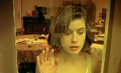
Photo: Still from Kieslowski’s "La Double Vie de Veronique"
Applying Textures in Photoshop
So, Ive stumbled onto a "new" process of adding textures in Photoshop. Its all brush work and the whole process is probably already done by many, but its a "new to me" thing that allows me to get exactly the look im going for and not be at the mercy of the brush im working with. Instead of using 1 brush and "stamping" it onto a layer, i will use multiple brushes with different opacity/flow settings and sizes. This allows for greater control over the final result and just by using a mouse and the Brush Presets defaults.
STEP 1: Background Prep
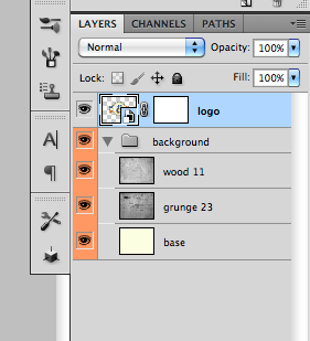
It would look really odd to have a textured design on a flat color, so i always have a textured background when doing this. Most of the time, i blend textures and/or images together. Here, ive used 2 textures on top of a solid color, "Desaturated" the image, set to "Multiply", and lowered their opacity to around 20% each. I'll also use gradients of black/white and color over the top of the image or Lens Blurs, but i didnt go that far here.
STEP 2: Placing the Art
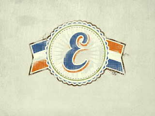
I recommend placing your art as a Smart Object into PS, if it is vector. You can then scale it up or down any time and not lose any resolution. It will need to be pixels if you want to warp it in any way though. Once its placed, just find the appropriate size (i made it a bit larger that usual for visibility reasons) and add a Layer Mask. The mask is where we will do all the dirty work.
STEP 3: Brushing the Clean Away
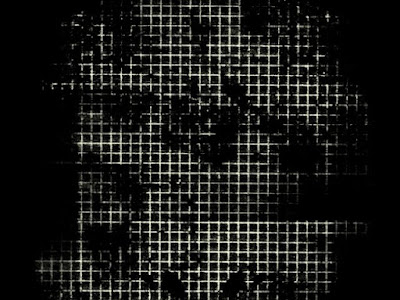
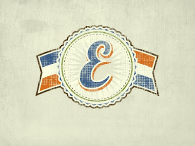
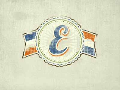
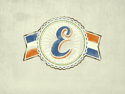
My favorite set of grunge brushes is the Dirty Grid set from ThinkDesign. you can get them for free here: DIRTY GRID. The first image above just shows what i'm applying to the Layer Mask. (make sure you are in the Layer Mask and painting black to "remove" pieces of the logo). The 2nd image shows the overall look im going for. i use the brush on 100% opacity/flow and go a little bit extreme with it. Thats the point, because we're going to take some of that away next. No need to mess with other brush presets here. I also alternate the size of the brush. Always click and never drag the brush.
STEP 4: Edge of Destruction
If this logo were a sticker or paint on a wall, you would probably see some destruction along the edges after some time. Thats the effect we're going for here. Just take one of the basic chalk brushes on 100% opacity/flow (still in the Layer Mask) and drag it along the edges of the logo. I also did it inside the logo along some of the hard edges. Remember at this point its better to take away too much than not enough.
STEP 5: Peeling Back the Mask
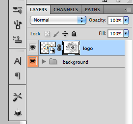
This is the step that allows you to have complete control over your texture. You dont have to settle for what 1 brush gives you. We're just taking a basic soft-round brush with the above settings and now painting white into the Layer Mask. This will remove the texture from the logo. With the low settings and soft brush edge, you will be able to "blend" the texture into the logo. Just as reference, heres what the mask looks like in the layers palette.
STEP 6: On the Fringes
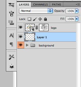
To go the extra mile, you can also add the effect of loose threads or overspray. Create a new layer underneath the logo and select color from the logo's edge, in this case brown for me. go back to the chalk brush and lower the settings a bit. what i used is shown above. The final picture is the final result. The key here is to never drag the brush but to go one click at a time. You'll get a smudgy mess other wise.
Happy Texturing.
Used book gem!
litquake...Litquake...LITQUAKE!!!
the Tuesday interview: Lindsey Leavitt
For a man that never wanted to be born, Tristram Shandy has aged quite well.
"Nothing odd will do long. Tristram Shandy did not last."
"The man Sterne is worth 1000 Pedants and commonplace-place fellows like Dr. J[ohnson]."
- Arthur Schopenhauer
"Tristram Shandy is the most typical novel of world literature."
- Viktor Shklovsky
Tristram Shandy is the "undoubted progenitor of all avant-garde novels of our century."
- Italo Calvino
"[I]t is my best text."
- Javier Marias, on his translation of Tristram Shandy into Spanish
Tristram Shandy is "the best Book, that has been writ by any Englishman these thirty Years, bad as it is."
- David Hume