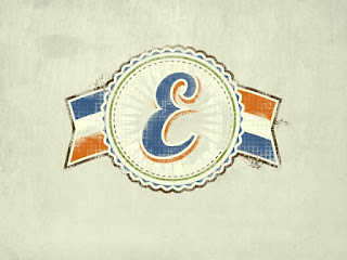
So, Ive stumbled onto a "new" process of adding textures in Photoshop. Its all brush work and the whole process is probably already done by many, but its a "new to me" thing that allows me to get exactly the look im going for and not be at the mercy of the brush im working with. Instead of using 1 brush and "stamping" it onto a layer, i will use multiple brushes with different opacity/flow settings and sizes. This allows for greater control over the final result and just by using a mouse and the Brush Presets defaults.
STEP 1: Background Prep
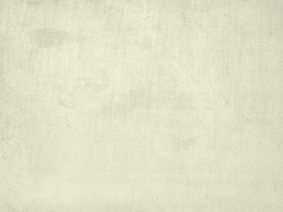
It would look really odd to have a textured design on a flat color, so i always have a textured background when doing this. Most of the time, i blend textures and/or images together. Here, ive used 2 textures on top of a solid color, "Desaturated" the image, set to "Multiply", and lowered their opacity to around 20% each. I'll also use gradients of black/white and color over the top of the image or Lens Blurs, but i didnt go that far here.
STEP 2: Placing the Art
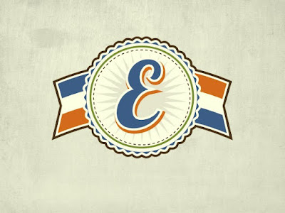
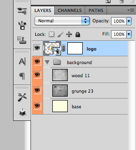
I recommend placing your art as a Smart Object into PS, if it is vector. You can then scale it up or down any time and not lose any resolution. It will need to be pixels if you want to warp it in any way though. Once its placed, just find the appropriate size (i made it a bit larger that usual for visibility reasons) and add a Layer Mask. The mask is where we will do all the dirty work.
STEP 3: Brushing the Clean Away
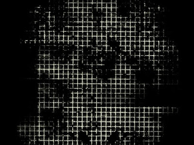
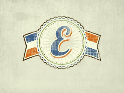
My favorite set of grunge brushes is the Dirty Grid set from ThinkDesign. you can get them for free here: DIRTY GRID. The first image above just shows what i'm applying to the Layer Mask. (make sure you are in the Layer Mask and painting black to "remove" pieces of the logo). The 2nd image shows the overall look im going for. i use the brush on 100% opacity/flow and go a little bit extreme with it. Thats the point, because we're going to take some of that away next. No need to mess with other brush presets here. I also alternate the size of the brush. Always click and never drag the brush.
STEP 4: Edge of Destruction
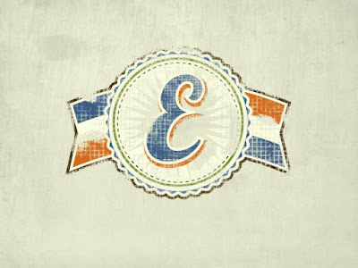
If this logo were a sticker or paint on a wall, you would probably see some destruction along the edges after some time. Thats the effect we're going for here. Just take one of the basic chalk brushes on 100% opacity/flow (still in the Layer Mask) and drag it along the edges of the logo. I also did it inside the logo along some of the hard edges. Remember at this point its better to take away too much than not enough.
STEP 5: Peeling Back the Mask
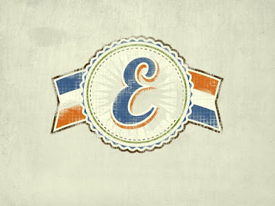

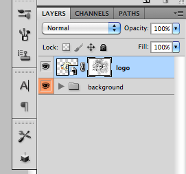
This is the step that allows you to have complete control over your texture. You dont have to settle for what 1 brush gives you. We're just taking a basic soft-round brush with the above settings and now painting white into the Layer Mask. This will remove the texture from the logo. With the low settings and soft brush edge, you will be able to "blend" the texture into the logo. Just as reference, heres what the mask looks like in the layers palette.
STEP 6: On the Fringes


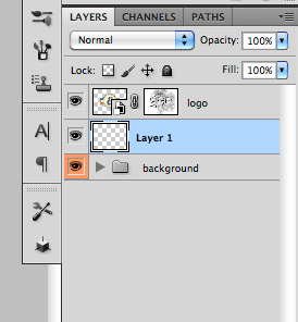
To go the extra mile, you can also add the effect of loose threads or overspray. Create a new layer underneath the logo and select color from the logo's edge, in this case brown for me. go back to the chalk brush and lower the settings a bit. what i used is shown above. The final picture is the final result. The key here is to never drag the brush but to go one click at a time. You'll get a smudgy mess other wise.
Happy Texturing.