Going Back, To Go Forward.


A year ago I wrote about moving to Columbus, Ohio and going to work for J. America, designing apparel for THE Ohio State University. Today I am writing about leaving the Columbus. I wasn’t looking, but an offer came along and the timing is right take the next step in advancing my design career.

In March, I will be moving back to Orlando, Florida as Lead Designer at Three21 Creative, a small but upcoming ad agency where I will lead the branding and identity development of the group, who are all Full Sail University alumni like myself. My hope is that there will be lots of sports branding opportunities, and that is something I am looking forward to pursuing. 

For a while now I have pictured myself doing this type of work and living in Florida as “the dream”. But the opportunity has come earlier than I ever thought it would and is bittersweet. It actually was not an easy choice to make. The people I have worked with at J. America from top to intern have been truly amazing and have made coming to work every day an absolute joy. I am not sad about leaving Ohio, or leaving the work load, but I am very sad about leaving the friends I have made over the last year. It was a group that grew fast, that experienced some scary moments together and more laughs than you can imagine. It is a special group of people that I will remember forever and hope to always be friends with.

No one knows how much and how hard we have worked to make the Ohio State apparel product the best it can be. I think in the fall of this year it will show and people will be very pleased. Because I have seen a few season lines down the road, I know it only gets better and I’m sure will continue to do so each year. I really think Ohio State fans will love J. America product, and I am very proud to have been a part of it.

So, now I am a Banksy loving graphic designer at an advertising agency. Im sure there’s a good joke in there somewhere.

The Bee's Knees: Charlotte Hornets 2014 Identity


The Charlotte Hornets return to the NBA in 2014 with a fresh identity upgrade developed by Rare Design and Nike Jordan Brand. There is a whole hoard of new logos, 9 to be exact, enough to field a baseball team. I feel that number is quite excessive, especially when there are multiple styles being used throughout the package, but overall this is a fantastic evolution to one of the most unique and beloved sports identities ever.

COLOR PALETTE


According to ESPN's Darren Rovell the "Bobcats discovered that old Hornets gear had 8 different shades of teal. Picked color for new logo that all 400 licenses can use". Thank you Pantone! The new palette is not only going to be more consistent across many different manufacturers, but I think is much better than before. The teal is more blue than the original, and the darker purple provides fantastic contrast.


PRIMARY LOGO


It’s a standard modern NBA angry-mascot-over-text-with-basketball concept. Instantly, I love the hornet and type, but hate the inclusion of a ball. I’d love to see just 1 team do a new logo system and forget that overplayed element, especially because it’s forced here as the lower body of the hornet forms a ball with a stinger coming out of the bottom. The use of the legs is clever, framing a shield/backboard around the type. I really love the way the crossbar on the H mirrors the S, balancing the whole mark and keeping it's symmetry.

2 other minor complaints; the teal on the wings feels odd; making them look a bit too heavy and I think the gray outline is 1 too many for this mark. Ignoring some of those details that most won’t notice or care about, it is a really cool logo that I expect to become a favorite among NBA fans very quickly. I already want a tee shirt!

SECONDARY LOGO


Here we have a 3rd hornet design (counting Hugo) that mirrors the primary very well. It is a very nice mark that suggest speed and athleticism, and forms an abstract "C". It could easily be a primary mark and looks like it's ready to sting the fuck out of somebody!. But, damn it, that belly ball idea again!

HUGO LOGO


I don't know how i feel about this one. The primary takes us in a totally different direction, and has a totally different personality than the old logos, but they have updated the old primary logo and moved it to a secondary position of sorts, where it seems it will only be used to represent Hugo the mascot. It feels like they wanted to move on from this concept but couldn't quite bear to part with it, so they decided to just keep and evolve it to match the new stuff. I think if they were too in love with the original logo to dump it, they should have just kept the original with updated colors. It would not have been anymore out of place than what this update is, and comes with pre-packaged nostalgia.

As part of the unveiling, the organization also announced that the beloved “Hugo” will officially return to Buzz City as the team’s mascot. The Hornets brand identity includes a modernized version of the original “Hugo” logo that will be utilized for the mascot and its brand. This logo is designed and intended for use as it relates to Hugo, and supplies the organization with a separate identity for one of the NBA’s most famous mascots. The refreshed Hugo logo contains several similarities to the original, with Hugo wearing white gloves and basketball shoes, possessing that trademark smile and having the letter “H” on his chest. Rather than bouncing a basketball, the updated logo continues the theme of the basketball as part of the hornet’s body. - nba.com/bobcats

Aesthetically, I like the consistency with the wing style. But the placement is off, and it looks like both wings might be growing out of his left (viewer right) shoulder. The addition of some J’s is a nice touch and is an idea that could have made this logo really likable. Except the idea of making the body a basketball makes me absolutely hate this logo. I have issues with sporting equipment in logos to begin with, but this is as forced of an idea as you will see and looks very weird. It’s minor league/Brandiose-like cheesy. 


HUGO SECONDARY


I guess the secondary mascot logo needs it’s own secondary logo. I'm not sure how this one will be used, but I assume it is purely for the mascot, where the other could still be used to promot the team. I imagine it on advertising flyers like "Come out and meet Hugo!" or on apparel that will be directed to kids. It's quite nice; very refreshing to see a logo without a basketball gut. I think a spur should have been put on the "O" here though to better reflect what they did in the type of the primary logo. 

WORD MARK


Image from Raredesign.com

I don’t really see the need for such a simplification of the word mark in the primary logo. Looking at it in embroidery application, I think it would still hold up with a drop shadow background, but I get it. Making it as simple as possible is a good idea. With as many logos as we have though, I’m surprised to not see an option that looks like it was cut right from the primary. It’s good type for a sports team that holds up well at small sizes. Would look really good at the ends of the court.

PRIMARY ALTERNATE LOGO


This is the primary logo without the word mark and is definitely one we could eliminate from the family. I don't see how this one serves any purpose that the primary and secondary can't.  It only clutters an already large family of logos. Some constraint on the numbers would strengthen the whole identity.

MONOGRAM


Why not a monogram? Okay, the monogram is cool and has some Charlotte flair with a honeycomb/hive shape that works together nicely. It could be a cool center court design but so could 4 of the previous ones. 

I DONT KNOW WHAT


I haven't the slightest idea what this one is for. It's another that should be cut. My instant impression is that it is for women's apparel, but who knows. 

BUZZ CITY


Image from Raredesign.com

There are a few odd ideas in this identity, but this might be the oddest. “Buzz City”. Yea? That’s what you want to be known as? I don’t know how many people will wear merchandise with this on it, but I’d respect the hell out of them for wearing it in public. I don't think this one will last long and will eventually be cut from the identity. At least, one can hope. It's a cool enough looking mark, but it screams "Minor League slogan."

WRAP UP


As a designer, there are things I have to pick at. Brand identity needs to be focused, with all of its designs moving in the same direction. Variety is good, but there has to be unity and this system lacks that overall. Just cutting a few logos would correct it. It’s bad enough to give an audience 9 logos, but worse to do it with inconsistency in direction/personality/aesthetic.

From a pure fans perspective, this new identity is really cool and exciting. It brings me back to the 90s, where everybody had Hornets Starter jackets and gear. It’s enough to make stuff fly off shelves, taking advantage of the tail end of a big teal and purple trend in the marketplace but the color palette also keeps that nostalgia factor from the original team and completely sets them apart from the rest of the competition. It's an identity that not only is very much wanted by fans but needed from sports. It's an identity that will never be confused with another team and despite those "ball bellies" and multiple design styles, It's something that gets just as many things right and is going to work very well with fans.
   

Graphic Language: What is Design?


“Good design is invisible”

Well, that’s a boring ass way of looking at a visual art. . . I’ve heard that quote many times but don’t know what dork said it. Probably a web developer or industrial designer :) Definitely not someone who makes logos, posters, product packaging, book covers, or street art.

Design is many things and to try to make it one thing is silly. That quote dosen’t touch all the things that design is, but I get it. It touches things like street signage. Usually in every town and city in America you go to the street signs are green with white Helvetica type. They serve an information purpose and are designed to communicate that info quickly and efficiently. That kind of design is invisible to the extent you don’t think much about it and it is accepted as a natural part of the environment. It causes no harm and does nothing to make you take notice of the things it’s doing wrong, or ruining your experience of driving. That kind of design does not have the same principles as a movie poster or sports car.

Design is graphic art, information, language, communication, technology, a chair, an engine, a plan, an idea, a dream. It’s emotional, or it’s not. It takes a long time to do, or it’s done in a minute. Design is so much more than a single quote. It’s a creation with a purpose, if only the purpose it to create something. I can’t explain it any better than that.

Graphic Language: Application & Environment


As graphic designers, we design things for other things.  Logos for websites, graphics for packaging, type for posters. What we do goes on something else and whatever that something is has to be considered in the design process. It’s not enough to design something that communicates the right messages and looks good on paper or in Illustrator, it needs to do all that on whatever it’s going on to. This is the importance of graphic application.

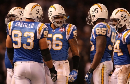
Think of a football helmet. It’s contours, ridges, and obstacles (ear holes, vents and bumpers) have to be considered when designing something to go on it. A good example is the Sand Diego Charger’s logo. The lightning bolt was designed specifically for its shape and lines to form perfectly to the helmet.


The next step is to consider the environment in which your design will live. That thing you designed for that other thing is going to be viewed on or in another thing or place. Think of a billboard, and is it surrounded by trees or buildings? Is it in a climate that experiences all seasons or just the good one (summer)? Is the label on that bottle going to be seen along with 100 others on a shelf or just 10? How’s the lighting? All things to be considered when choosing type, color, material, etc.

Also, show your design in its proper application when presenting to a client. A special ability of designers and artist is to look at something and see something else. Especially with our own designs, we see them as they will be. But, a lot of clients still have to be sold on the idea. Don’t be like Pentagram and show your BIG TEN logo on a USB drive, that’s fucking stupid! That’s not where the logo is intended to live. Show it where it lives.


The Destruction of Banksy's Work Is A Good Thing


If you haven't heard, the Bristol street artist Banksy is in New York City this month putting on an outdoor art show of sorts titled "Better Out Than In". Local taggers and graffiti artist seeking attention and the need to protect their own "turf" have been going over Banksy's work about as soon as it's put up.

It's frustrating to know that Banksy's work will not last long enough for me to ever travel to NYC and see it in person. If it's not the attention whore taggers writing over it, it's the city itself washing it away. But, that's the understanding that every street artist has. They have a detachment from their own work because they know it will not last forever. It's not meant to. Even if it survives the defacers and pressure washers, it will fade away due the rain, sun, and wind. What makes so many pieces special, is that it is there for only a brief moment in time.

Still, there is a bigger enemy to Banksy's art. It's those who take the pieces from the streets to sell and profit for themselves. Some people label him a "sell-out" because of his commercial success, but if he's getting paid for work he's done and someone wants to give him $1 million for it, then good for him. If someone who had nothing to do with the work gets paid even $1 for it, well, I don't think theres even an argument to be made why that's not completely stupid. (On a related note, some douches were guarding the beaver on Bradford St and charging people to see it.)

All the people who feel the need to paint their name over his work to in some way teach him a lesson or for their own recognition, are doing Banksy a favor. If it's defaced then there is no value. The piece actually is protected in that way. For that reason I'll probably never see a NYC Banksy in person, but I would rather look at photos of them than know some jackass lifted it from the streets and sold it to some other jackass art collector.


Graphic Language: The Trenches of Creation


Most of us don’t have a lot of spare time during a work day. That’s why we say our time is valuable. That’s why the work we devote time to comes at a cost to our clients. The final products we create for most projects are only one thing. In the end, there’s only going to be one logo, one site, one poster. But it takes a lot of work to get to that one thing. Dozens or hundreds of ideas are sketched out or written down. Then maybe a dozen different versions of a single idea worked out.

And why? How many times do we have to twist and turn an idea into something slightly different before we’re satisfied with a version of it and see it as a final option, or so dissatisfied with all versions that we throw them away?  How many times is that process repeated on a different idea during a single project? I think it’s because that’s just what it takes to do good work, and good work that’s unique and special, and lives up to our own full potential lives deep in our sketchbooks (or computers).  

You don’t just get to unique and special right off the bat. Your first idea is probably a cliché’ or something you’ve seen done before, so we push beyond that. It might actually take a couple of pages of sketching to get to those good ideas, and we should dump as many ideas into our sketchbook as possible. Then we might do multiple versions of the same idea. That’s all for the creator, that’s why your time is valuable, because you’re fighting in the trenches of creation, thinking and critiquing and researching and redrawing and second guessing why you ever chose this career. . . all for one good logo (or whatever).

A lot of times, we’re trying to meet a number set by the client. Even if you’re presenting 10 options to someone (I don’t suggest you ever do that many) in the end, there will only be one, and fuck, it’s hard to get just one good one! Why go through the pain of 10? Sometimes we can get 2 or 3 but any more than that and I bet most of us start running into the mediocrity wall. And I would much rather present 2 or 3 well executed, interesting ideas than 10 just to meet a number so a client can feel like they’re getting their money’s worth. They’ll get their moneys worth with one good idea, not with a bunch of average ones, or a bunch of average versions of an idea. That’s why I don’t let the clients set a number anymore. It’s not to anyone’s benefit.

And inevitably, if you allow someone to choose from a large stack of concepts, where there is one you really dislike and know is not as good (but it’s there because you’re trying to meet a quota) the client will choose that one. I promise you, it will happen most of the time.  Because that’s probably the one that’s safe and familiar, and that’s what most clients want to feel, but is the feeling artist hate most. Not everyone has the balls to do something unique and special.

Paul Rand presented clients one logo. He felt they hired him to solve a problem, and the thing he presented them with was his best solution to it. They needed one thing, so he created one thing. I would love to see his sketchbooks though. I’m sure he drew a lot. But I’d like to be more like Rand. “here’s the solution to your problem. Thank you”.


How Do I Logo?


There's no solid definition for what a logo is or should be. You won't find too many designers that agree 100% on what makes a good one or a bad one. Taste is subjective too, even really terrible logos have their fans. But, I can tell you what I think a good logo is.

I'm not going to tell you any magical secrets to logo design or that every logo should follow the same set of rules. Some logos need to do different things than others and they follow their own rules. Some make use of a clever idea and pull something personal from the thing it represents. Others are just for "performance" and need to do their duty, like sit in the corner of a webpage and identify what that page is. Some represent a culture with a specific concept, pattern or color (sports fans think of the Tampa Bay Buccaneers and Seattle Mariners), while others express a single idea well and are built to be absorbed by it's audience and become a permanent mark of the culture later (think Indianapolis Colts and Chicago Cubs).

Either way is fine, but understand that no logo is born with emotional value. That is earned over time, which we call equity. Most people don't like change and would rather their favorite brand hang on to the shitty logo they've always known than replace it. If it's a new logo/brand there will be many haters of it once it's debuted. It gets understood and accepted and loved over time.

What I will tell you about logo design is only what I can tell you. My views on logos are defined by learning from other designers, my own education, and my own experience. . . and a lot of time being a dork and thinking about logos. If I could sum up what a logo is, it is a thumbprint. To sum up what it does, it identifies something, then communicates a message about it.

Logos, like all design, send a message; and whether you're doing something personal and clever or just something to perform well, there is always a conversation with it's audience. Design is not all about aesthetics. Aesthetics are the least important thing about design. Your ideas and connotations and emotional responses to design are what makes it valuable and good. Form follows emotion. And study your history too. Colors and symbols can easily pull mental images of the wrong thing if you're too focused on aesthetics and visual performance. I like to use the example of the worst idea in Pro sports branding history: Putting a team named the New England Patriots in a red jersey and white pants.


That football uniform looks great, doesn't it? . . . But the concept fails.

What I use to define a good logo is a set of measures that I believe in fully, but I don't think all of them need to apply to every logo. Again, some logos just need to do different things.  I start with the idea and emotional expressions. You don't need all 3 every time, but if you can capture the 1.) Personality 2.) Culture 3.) History, of something in a single logo, you've got a great concept. And those are listed in order of importanceDesign always has a personality though, so make sure you're expressing the right one.

The next set of measures is about the performance of the logo and the more tangible aspects of it. These are the duties that need to be carried out by the design. If a logo "works" well, then it does these things well. Sometimes, a few of these are all you need. There's some overlap too, for instance simplicity helps visibility and memorability, good color choices help with distinctiveness, etc.

Visibility – Readability and clear form, even at small sizes.

Application – How and where it's used. If it's going to live primarily on a football helmet, then that's the main thing you have to focus on. Design for that thing first. Also think of environment. If everything that surrounds it is green, then green probably isn't the best color to go with. 

Distinctiveness – Different from brand's competitors. It has to be able to be different enough to be easily noticed. 

Color – The color has to be pleasing as well as having qualities on this list of it's own like visibility and distinctiveness. A great logo can be ruined by a bad palette. A single color can express the brand's full personality. I believe color is one of the most important elements of design and you can never know too much about color theory and meaning. BE GOOD AT CHOOSING COLOR!

Simplicity – Helps memorability, timelessness, and reproduction across multiple mediums and sizes. A logo dosn't have to work in black and white anymore, that's dated thinking. But it is still good practice for seeing simplicity in form.  

Memorability You want people to be able to recall your logo without being reminded of it. They should be able to clearly describe the idea. "The football team with the G on the helmet" is better than "The football team with the circle and weird brown thing in the middle" 

Timelessness – Dosen't use design trends or rely on new technology. Sometimes It's okay to follow those trends. Sometimes It's okay to build a logo with a short shelf life. But not if you're going for timelessness. It should never show it's age. 

Equity - The longer a logo is around, the more it soaks up the brand of a company and becomes a symbol of what the audience thinks of the product. Coca-Cola's logo isn't great typography, but the sight of the logo usually brings thoughts of happiness and togetherness, because thats what the brand is, and that's the emotional value. If a logo has good equity, don't change it. 

Modularity – Versatility. Can it be a mascot? Some logos have to be. 

Appropriateness - It should fit the brand goals of the company, and the culture of it's audience. I've always felt the Buffalo Sabers "Buffaslug" was a great logo, just for a football team instead of a hockey team. Still, I'm one to push the appropriateness level to the very edge, doing what's right for the brand and letting the logo find it's audience. That's kind of the Apple way of doing things.   

Descriptiveness -  It needs to communicate what you do. This is more for lesser known brands. You probably don't want to use a snare drum in the logo for a plumber. 

Craftsmanship – Dont ignore technical skills. Milton Glasier said "To design is to communicate clearly by whatever means you can control or master". Don't worry if you can't draw like Leonardo da Vinci, most can't. Just know the design principles, theory, and do good work. Don't be afraid to break some rules too; don't lose your own design personality or confuse craftsmanship with perfection. 


The end result of a good logo should be something people are proud of. Something that you wouldn't mind wearing on a t-shirt. And, if it's a sports team especially, try not to design something that it's rivals can easily make fun of. My personal redesign of the Indianapolis Colt's horseshoe was said multiple times to look like a toilet seat. . . well, fuck!

Check out some of my favorite logo designers:


Fraser Davidson - Marc Verlander - Kris Bazen - David Airey - Tin Bacic - Jan Zabransky - Gert Van Duinen - 

Something Bold; Something New


When I was a teenager learning to play guitar, one of the ways I kept myself interested was by constantly incorporating something new to learn. There was always a balance of mastering my strengths (growing vertically) and adding challenges (growing horizontally). There was something about the guitar that always felt comfortable to me. I was never intimidated by things I couldn't play, because I knew I was working my towards them, and one day I would eventually arrive there.

I have tried the same approach with drawing, but gave up on new things if I didn't grasp it quickly. My problem has been one that many other artist struggle with. The road to mastery is never short or easy, but in our minds we imagine it to be so. Probably because our heroes make it look so easy.

I think I know why I've had more patience with music than pencil and paper. I'm better at music and the learning curve for me there is shorter, and there is always another challenge waiting to be met. But I can't seem to draw a good human figure for shit. There has been improvement over the last 23 years, but sometimes It's like not being able to get over a barrier no matter how hard you try. There's no moving forward, and I lose interest in trying.

Instead of looking at that barrier, becoming frustrated and giving up because I am unsatisfied with my work, I have recently embraced my mediocre-at-best drawing skills, and challenged myself to get over that wall. The way I'm doing this is by doing a lot of drawing and not worrying about how bad it is. I'm doing the best I can, learning from each one, but if it turns out worse than I expected, I don't worry about it. I just move onto the next one. I'm drawing on paper and with a Wacom tablet too. There's not much difference between the two, but I've always enjoyed the feel of pencil and paper. To actually touch what you're working with feels more rewarding, but stylistically, I love the digital look.

The fuel for this fire has been the most exciting thing. I'm doing posters. Posters based on global issues, world events, and politics. Generally, just things that are more important than corporate logos and sports team uniforms. I guess I'm following the footsteps of some of my favorite street artists in that way like Banksy and Sheppard Fairey. I also have a list of my favorite movies and songs that I want to do a poster design for. All the song posters are going to be done on paper and colored with soft pastels.

Even if I don't get any better at drawing after all this, at least I will have created something. Which is always better than creating nothing.


The Long And Short Of It: Colts' Truncated Stripes


In the world of Pro pigskin aesthetics, one of the topics that always creates a debate is the modern application of the Colts’ (and LSU, Iowa State, NY Jets, etc) jersey stripes. The controversy is how they should look on modern football jerseys, with one side claiming they are too short and should extend down to the armpit, the other side saying the current solution is the best. The claim that they “should wrap all the way around the arm like they were designed to do” is a non-starter because they didn’t even do that.


The issue is this is a design solution from the 1950s intended for a completely different problem. It’s an example of how form should follow function, and how good graphic design enhances the product. Jersey design has progressed over time, and they’ve gotten smaller, with shorter sleeves. This graphic has tried to come along with it, but at this point is just a shoe-horned element that dosent truly fit on a modern jersey template the way it was meant to do.

What jersey manufacturers have done is truncated the stripe at about the point of the collar on the front and the bottom of the nameplate on back. This solution has created a passable design using good judgment of alignment and space. That is until Nike really fucked it up in 2012, making the total width of the stripes much narrower than before, and pushing the stripes to the sleeve seam, where the smaller sleeves put the stripes on an angle, as much as 45 degrees on some players with no shoulder/sleeve tailoring to correct it.


Nike has taken a shot at lengthening the stripe design with LSU and trying to return it to it’s original integrity. They had to use a narrower number font when doing this, which in the end is fine, I think the number font is quite good. But because the jerseys are so small/tight now, it really starts to crowd the other elements. It’s a push for me from the previous solutions because it’s still a shoe-horned design that never had these modern uniforms in mind. Between the Reebok Colt’s solution and the Nike LSU one, it’s hard to pick a favorite, but I would go with Reebok’s as I feel it’s a better use of space.


Another issue is if you’re going to maintain your 50 year old design, you need this stripe. It’s always going to be botched, but a botched stripe is better than no stripe. It’s a huge part of the Colts identity. Those suggesting the uniforms be compromised to suit the jersey decoration have it completely backwards. Again, form follow function, you design graphics for the product, not the other way around. But, form also follows emotion, and there is so much recognition with the stripe for the Colts, they just wouldn’t be the Colts without it.  The other option is to blow it all up and start over with something completely different, something that actually works well with current uniforms, like Oklahoma State’s design. But blowing up a 50 year old identity that comes with multiple championships and lots of success for a current brand doing extremely well, isn’t a move that is necessary.

If it were up to me to design the perfect Colts uniform, it would be this. see the whole thing here: Colts Brand Adjustment


GO COLTS DAMMIT!!!

The Possible Future of Sports Uniforms


I’ve paid very close attention to sports uniform design for the last 5 years. Specifically, college and pro football. This year has been one of the most disappointing seasons for football uniform and logo design (actually, just the NFL in the logo department). It seems it’s been mostly about recycling ideas and copying what others have done before rather than creating something new. Although there are one or two new things for 2013, It largely seems like schools and designers are running out of ideas. But I think what lies ahead can be very promising, if someone takes advantage of it.

Socks – Socks are a growing niche for apparel manufactures as some are reporting a 35% increase in sock sales within the last year. This growing trend with the often overlooked and unexplored area of sock design in sports uniforms makes for a great opportunity for a school and designer to take advantage of. Especially for UnderArmor, Nike, and adidas, where everything they do is to direct you back to shoes. Because the sock/shoe combo is such a great hook in stores now, they do offer socks that will combo with your new pair of kicks. But the attention could be driven more towards that if they took advantage of a sock design for one of their major college clients.

Everyone is racing for the helmet now, and sublimated patterns and unique designs within numbers and jersey sleeves have been around for a few years. The unexplored ankle area could be one that these companies will compete for soon. Under Armor is experimenting with sublimated sock designs now for purchase in stores. Don’t be surprised if Maryland football rolls out with a school specific pattern on their socks ala’ the popular pattern-within-numbers trend. Oh, but let it be known I though of it first 3 years ago :)


Cooling Technology – I’m not sure if this will make it’s way into the jersey and pants fabric for football because it’s a cold weather sport. Baseball and basketball could be different stories though. But what I envision for under shirts, sweatbands, arm sleeves, skull caps, helmet liners, and headbands is being made from self cooling fabrics.

Conventional wisdom says that to cool the body, you need to move air and have ventilation; something modern jerseys and helmets are designed to do. But with these new materials, companies are saying cooling comes from conduction, where the material cools the skin. Basically, when the fabric gets wet, it gets cold.

Adidas is already in the game with Climachill, which will hit the marketplace in spring 2014. It acts like a mesh, using titanium cooling fibers and aluminum silver dots that cool the body. A company I’m more interested in is Dr Cools (drcoolrecovery.com) who also has material hitting the marketplace in spring 2014. Their biggest piece right now is a hoodie which is endorsed by Reggie Bush, using EnduraCool technology. It does the same thing as adidas’ version in principle; when the material gets wet from sweat, it gets cold. Another company doing the same but I know very little about is NEXAR.

Helmet Design -  We have seen matte helmet finishes and matte vinyl graphics before. I have yet to see matte properly combined with a gloss finish. I have to believe though, that it’s only a matter of time before the muscle car influence hits college football where a matte decal is set on a gloss finish (it’s always the other way around). I think it would be an excellent combo for the ever popular black-on-black look, as seen below.


There’s also a whole world of vinyl graphics that the football game hasn’t seen yet. Oregon has used fluorescents on their helmets, and a few others have used chrome-color on theirs. But we’ve only touched the tip of the iceberg. There’s so many other fluorescent, pearlescent, reflective, metal flake, chrome-color, engine turn, gloss, matte, satin, and translucent options available that I’m not even sure if Nike, UA, and adidas even know about. It dosent have to be a gaudy, in-your-face application, just imagine a helmet with a matte-chrome (kind of like brushed aluminum) finish with a 1 color logo in any of the previously mentioned materials. There is plenty of original ideas waiting to be discovered.

It would be great to see any of these ideas actually used in uniform design, but like all the other trends and advances, it has potential to be abused. There's nothing wrong with gradients and matte finishes and such, but the way they are used most of the time is horrible. Most critics and sideline designers want to put all the blame on the designers, Nike, adidas, etc. But the clients are the ones getting what they want in the end. They're the ones making the final calls, and if they're already doing a shit job of handling what's available to them now, then they'll probably do a shit job of handling everything else to come after it. I like to stay positive though. Can someone just please do a matte black decal on gloss black helmet for me!?!?

The Stars at Night, Are Beveled and Bright: Dallas Stars 2013 Identity


It’s not often I find a hockey identity I really like. Not because the NHL has more bad designs than any other league, I’m just not that big of a fan of the sport (Or any other sport outside of football, really). But, instead of that being a weakness for me when critiquing a hockey identity design, I think it’s an advantage because I’m not jaded by the “rules” and cliché’s of the sport’s own aesthetic. It allows me to see the design purely without any emotional attachment or idea for what hockey design “should be”.   The Dallas Stars’ new identity makes me care about hockey. This identity I notice and am excited about.

Color

From what I know of the Stars, they’ve always included green, gold, and black in the identity. Replacing gold with silver definitely will be a bit of a shock to Stars fans, and will make the design at first seem unfamiliar. The fresh Victory Green and Silver palette instantly signals a new era in the franchise. It’s very bold and energetic and the team should really feel big and fast when seen on the ice. There were about 5 different color palettes being considered for this, with blue and silver (an impending disaster) being highly favored by the team. 

Type

from dribbble.com, Andrew Sterlachini: LINK


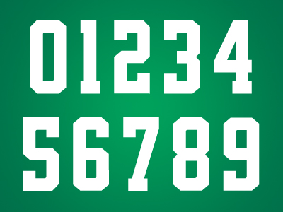
After looking through so many terrible number fonts and type systems from Nike in college football and the NFL this year, it’s refreshing to see a font system done so beautifully. The numbers are a slight variation on a standard block, but it’s the best typography I’ve seen in sports this year. It’s consistent from one character to the next, yet the variation makes each one unique enough. Notice the 6 and 9; they’re not mirrored, but individually designed to be it’s own digit. I fucking LOVE these numbers!

The word mark isn’t as good. It feels skewed too much and the heavily beveled “STARS” feels disconnected from the city name, which was left untouched. With no containing shape or element to otherwise bring the two together it’s left looking a bit weak. It’s also the only logo that dosent include black.

Logos


Overall the new primary logo is a seriously cool and well executed design. I wish there was more of an emphasis on green with maybe a silver key stroke, but it’s a logo that looks great on the front of a jersey or a hat, or t-shirt, or whatever you put it on. It has sort of an old sheriff’s badge look to it too, weather that’s intentional or not I don’t know, but it definitely says “Texas sports team”.


I love roundels and the secondary is a solid effort. I’m not sure about the primary being included inside the center though. I think that’s maybe a missed opportunity to do something different there. The primary D-Star as it is dosen’t really have a strong presence inside the circle, it has to be small to fit inside and the lack of it’s strokes makes it seem odd when paired next to the true primary logo. I really prefer the “Dallas Stars” type like this, un-skewed and un-beveled, but again it lacks some consistency when you match it to the true word mark. Overall though, it does look good on the shoulders of the jersey.


Counting the word mark, the tertiary is actually the 4thlogo in the family and weather it’s needed, I’m not sure. It’s a cheesy, cliché concept (state shape) that really gets played out in Texas themed logos. Again we see the primary used here in an awkward space making the logo heavy on the bottom and the tangent on the top point of the star touching the top of the state’s outline makes me cringe. Instead of forcing the primary into the space it wedges in best, I’d rather see it centered within the state shape, or even another idea here. A monogram, or single star, or put the roundel around it. Despite it’s flaws and terribly cliché concept, it’s still a likeable logo and I think Stars fans will really dig it.


Uniforms


The uniform is unique in color and type, but features traditional hockey striping. It works really well though, because as detailed as the logos are I think it was a good idea for the uniforms to be very simple and let that great green color and new logos be the hero of the design.

I know it’s a fairly common style, but I don’t like the green shoulders on the white jersey. It looks like the pointless color blocking you see a lot in college football uniforms. Personally, I’d rather see the jersey be all white (outside of the stripes). The striping on the white jersey and socks is really great. I love the alternating color and wish the same would have been done on the green. What confuses me most is the shorts are the same for both sets. They match the green jersey but looks too different with the white. It’s not a big deal but I’m not sure why they designed a jersey and socks stripes to be different on each set but wouldn’t do the same with the shorts.

One slight complaint is the total lack of detail outside of the logos. All of the uniforms elements are solid, flat color blocks, but each logo is so intricate there is some disconnect there. Like I said before, they didn’t need to do a lot with the uniforms, but I’d like to see a bit more cohesiveness between logos and uniform elements. Maybe some silver lining on the stripes or the numbers? It just lacks some detail that would visually tie everything together.

It’s not a perfect identity, but there is so much here to love. The color is my favorite part. The package as a whole is so good, I almost want to be a Stars fan. I probably won’t watch many games, but I might have to buy a t-shirt or two.


Norsemen In Purple Satin: 2013 Minnesota Vikings


When the Vikings released their slightly updated Norseman logo, it was a clear sign of the direction they were going to go with the new uniforms. A modern-retro design ala' Buffalo Bills. Where the Bills went more traditional, the Vikings went more for the future. Of the 3 new NFL uniforms this year, this is the one with the strongest execution.


The helmet has a satin finish which makes them the 2nd NFL team (Seattle the 1st) to feature a satin primary shell. I really like it with modern uniforms especially, where the new materials being used for jerseys and pants have a satin or matte finish. (I hope the shiny uniform materials stay away in the future, that silliness should have died with disco.) It definitely has a rugged feel to it,  or as Jared Allen put it "Looks like we're playin' a man's game".

The horns got a bit of an adjustment and the best I can tell, they're just larger. Usually, a good thing but what we're seeing on the initial pieces is a tangent purposefully created where the horn tips touch in the back. Major points taken away for such an obvious visual tension, but hopefully they wont be that way once the season starts. It's strange to see the Vikings use a Revo Speed for showing off the new design. I don't think they should have adjusted the horn design just for this shell, it's just one option in a vast sea of helmets, but it's the one where they have to cut the decal to go over the vent.

People have flipped out over the use of a black face mask, but I think it's the perfect choice. Remember, this team is more forward thinking than the Bills, and black works very well as a modern neutral color. If it were grey, it would have a vintage connotation, and with the contrast would be a distraction, where the black is very subtle. There's also black in the horn and the base color for their cleats is black. So why not purple? If it were, then it would be a gloss finish and if there's a quick way to make a helmet look cheap and tacky it's mixing 2 finishes of the same color. So why not a satin mask finish? well that could be possible, I don't know what that process is like, but it hasnt been done before, so asking for that right now is a stretch. Why not white? Again, contrast. I dont like the mask to attract your eye and be the focus of the design. White also makes the bars appear larger, which makes it worse. Black was the way to go.


I think they started with the old Northwestern stripe design and used that to carve something new. Blending that with the sail of a ship idea turns out to be a really nice stripe. If there's one complaint i have there it's that there's not enough space between the 2 colors in the stripe. It's even worse on the white jersey where yellow and white meet each other. The stripes are sewn onto the jersey too, which the Bill's should take note of.

Per usual, Nike fails on the number font development. They are consistant though; consistently bad. I don't think a single number (either single or double digit) looks attractive at all. It's so odd to see one digit with the spurs and another next to it with none. If they left those spurs off, the whole uniform would benefit from it. It becomes a focal point of the uniform for it's oddness.


The pants stripe is one of my favorite details of the uniform, where you can see how they might have started with a Northwestern stripe. At the very least it looks like a nice evolution from that traditional design and give a sense of forward motion. I don't think anyone is aware that socks can have stripes on them. I would love to see the pants stripe carried over into the socks here.

The uniform is so close to being so excellent, but the number font keeps it from being so. It's definitely better than the Seahawks' and Dolphins' but it's not much consolation being the 3rd worse in the league.  The helmet, if they fix the application of the horns, will be one of my favorites. Satin purple just looks so sweet and tough. I doubt they keep the finish forever, but damn, it's going to be nice having it around while it's here. Grade: B