image from Bran New Blog
the Washington Nationals have unveiled their new logo system. a system that seems to be a throwback to an era that never was, at least in Nationals history and even Exos history. it does grab inspiration from the old Senators team however.
still, it seems like a strange move. this is a franchise thats moving its identity all over the place. the Senators are a team thats gone and forgotten. the Nationals used to be the Expos. why are the Nationals branding themselves as the Senators and abandoning their entire identity equity? not only have they reverted to a time period that they were never a part of, they've also made themselves a baseball cliche'; red and blue script font logo. at least the "old" logo was modern, unique and appropriate for the team. even if you dont like the illustrated bevel-and-emboss look, that mark fit very well with the local architecture. the use of gold a nice touch that separated them a bit from the other red and blue teams.
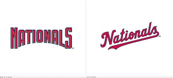
image from Bran New Blog
the "W" mark reminds a lot of people of Walgreens, and thats certainly an issue. sure its the old Senators mark (still dosnt make sense to me) but its too close to something thats larger than the team and has a larger resonance in America. the swirly "W" is visualy claimed by Walgreens even though the Senators may have had it first. (Walgreens was founded in 1901, not sure when their current logo came into use).
think of it this way, that number font the Dallas Cowboys used in the 70s was first used by the Eagles. but even though Philly had it first, it became "owned" by the Cowboys over time. no way would another team think of using that font because it now screams "Dorsett's and Staubach's Cowboys".

i think the thing that bothers me the most is that it just looks old. its simpler, its classic, it should last longer. but its like a manufactured throwback. and now they dont look like anyone, because they look like everyone. theres nothing visually appealing and they seem to be riding on the throwback trend (which i love) to carry their identity into the future. but what makes throwbacks so great is that you see those old designs on modern players/uniform templates and they bring back a nostalgic feel. theres just no substance, no equity, nothing special about this team here.