 We all know what a villain is, but a villian?
There are some things worse than being stuck inside on a hot day
It's hot out today.
Sweltering.
Even in the Inner Richmond. If I were smart, I'd have called in sick today. I'd be sipping PBRs on that great hipster lawn known as Dolores Park, book in my hand and tiny dog in my lap. But I'm here in the cool calm confines of Green Apple Books, buying and selling books. It ain't so bad at work after all. It's far worse out there:
[Guest post courtesy of Kate!]
[Guest post courtesy of Kate!]
tuesday interview from royalquietdeluxe
the tuesday interview: andrea seigel

Families are weird. Andrea Seigel gets that. She writes these pitch perfect imperfect characters navigating a sort of it-only-makes-sense-if-you're-related-to-us family dynamic. I found her book, The Kid Table, because Meg Rosoff recommended it and, well, she hasn't steered me wrong yet.
RQD: What are you working on now?
Andrea Seigel: Right now I'm working on screenplays more than books, so I'm writing a script about a new suburban community that starts up out in the desert and the teenagers that attend its very, very small high school. The main character is romantic to a fault even though she's never really had a serious love in her life- extreme romanticism has always interested me because of the divide between the way romance plays out on TV and movies and even in your head, and then the forms it might actually take in your real life. I'm also interested in the idea of a group of people who take a lot of meaning from the initial smallness of their group, which makes it special, and then following to see what happens when more and more people start to come in and dilute that club.
RQD: What about other influences?
AS: The album "Late For The Sky" by Jackson Browne wrecks me, but it also puts a really clear universe into my head, and if I could translate the feel of some of those songs into writing, I'd be amazed with myself. Thomas Kinkade is a big one for me. No, just kidding. There's a photograph by Matthew Spiegelman called "Reconstruction Florida" that I've loved and wanted for years, but can't afford. Oh, and Ralph Lauren's furniture. When I look at ads with rooms staged with his stuff, I get this feeling like I could get a ton of work done if I could just be inside them.
RQD: What book, story or poem do you return to over and over?
AS: I'm not really big on returning to things because I don't have the patience for it, but the two books I can say that I've uncharacteristically read through more than once are Catcher In The Rye and John Irving's Hotel New Hampshire. Catcher because I'll pull it out to soothe myself with the existence of a really popular book that's loose on plot, and Hotel because Irving is so intensely great at plotting (I'm not) that I like to go back and marvel at how that book is put together.
RQD: What are you reading now?
AS: I just got Meg Rosoff's new book There Is No Dog in the mail, so I'm starting on that today.
RQD: What did you read as a kid? What is its impact on your work now?
AS: As a littler kid I read a ton of Babysitter's Club, Sweet Valley High, Nancy Drew. I'm sure they had something to do with my favoring getting to know a character over everything else because I kept returning to series- I was more interested in tracking friendships and relationships than I was in whatever dilemma was contained within whichever individual book. And I'm sure that led right into my adult attraction toward soap operas, serial shows, and Us Weekly. I like the intricacies of personalities and smaller interactions more than I care about big external events.
2012 calendars are here
Each year, we anticipate that our calendar sales will decline a bit. Doesn't everyone use Google's calendar or some other electronic version? But you, beloved Green Apple customers, keep buying them. Thanks for proving us wrong year after year.
Well, we bought plenty again this year, about 900 different calendars in all. There are:
 page-a-days (to learn a language, have a daily laugh, or inspire you);
- weekly and monthly and daily planners, from pocket versions to big, handsome editions;
- and wall calendars, from tiny to huge.
The themes and images of these calendars reflect, of course, the diverse interest of our customers, from nature to eastern religion, San Francisciana to humor, sports to children's images.
As always, the selection is best now, as we don't re-order calendars, so come on in and get ready for 2012.
Its Not the Destination, Its the Journey

Theres been some great commercials this year, but by far my favorite campaign is that for the Dodge Journey. Dodge left 3 of their Journeys out in the “world wide world” across America and whoever finds them gets to keep them. The campaign’s clues to the locations are given on Dodge’s YouTube page. I know, it seems strange that Dodge is telling you to “get out there” when the campaign is so reliant on the internet. But, I feel this was the best way to do it. Point being to use technology to find the location then go get it. Moreover, the main point here was to get people out of the house and go have some real adventure. It targets the people who the Journey was made for and capitalizes on those adventurous and ambitious characteristics.
As im writing this, the first 2 Journeys were found rather quickly within 24 hours, but the 3rd currently is on its second day with no winner yet. The first couldn’t have gone any better, and guess who found it? An adventurous father and son who “love to explore”. The kind of people this vehicle was intended for. I believe Dodge wanted the cars to go to people just like them. Congratulations.
The second one unfortunately comes with some controversy. Seems an Oklahoma St Trooper had some “inside info” on this ones location. The State Police shut down some highway for Dodge’s filming and it was a State Trooper who found the car. https://blogs.automotive.com/breaking-second-dodge-journey-found-winner-declines-contest-prize-57177.html The official statement is he “declined” the prize, but my guess is Dodge wasn’t going to give it to him and decided to use the “he declined the prize” angle to make the State trooper look good. Not sure whats going to happen to the car.
So the third one is still up, and ive been following the clues and the whole thing the whole weekend. The theme here seems to be “paradox” and because its currently unsolved, I cant say how this ties in 100%, but the clues have lead people from Albany, NY to Portland, ME. Looking at all the pictures, video, and internet searching it looks like a beautiful ride between the 2 points.
While following the clues and whatnot, since im in Florida and have no way to the northeast, ive been reading a lot of the comments coming in through the Dodge YouTube feed. What is painfully obvious is so many people have completely missed the point of this campaign. “what a wild goose chase” and “glad I didn’t waste my gas driving around Vermont” and the like keep coming up. I hope whoever does find the final one isn’t one of these people who are in it purely for the car. These people don’t get it, and obviously not in Dodges target audience. Bruce and Matthew who found the first car are those that get it and deserve the car, because they would not have been disappointed if they did not win. The point of the campaign is to get you outside, into the world, explore the outdoors and have some adventure. Wheather its by yourself, with your family, or friends. Its not the destination, it’s the journey. Well done Dodge.
UPDATE: its been found. you can see the video of the winner here: http://www.youtube.com/user/dodge
also, while browsing the comments quickly i found this one. this is what its all about.
Thank You DODGE... I had an amazing time and saw alot of places that I probably never would have, your intentions to get people out there to see the world worked out very well, I saw alot and plan to go back to the area with my family
Moving Along
 There are no words to describe Green Apple and yet too many at once. They're all over the shelves alphabetically by author or piled on the floor. At Green Apple I read. The selection is maddening. Over my years wandering the store I've amassed an absurd horde of books on all manner of topic, books to sprain and tangle my already convoluted world views. Books on what a political body should be, on what cigarettes do to the mind. Books on feral children, Trappist monks, racist jokes, history of color. And of course as I collected them I read them. I read on milk. I read on Tintin's literary value. Theory of perspective, perception, suicide, cycling, and mother nature as a stone cold bitch. Poetry by Charles Simic and Hanshan. I understand Schrödinger's Cat now and my room is littered with collections of comics, European porno, Japanese horror and fervent American nihilism. I haven't even mentioned the novel after novel after novel of elation, depression, eccentricity or ennui.
These books speak for themselves, but the curated amalgamation speaks for the store, as expansive as the human condition. Big and fat and dense. This place is the best.
Sadly, deep within the core of my crappy body rests old Trundle, the verb, capital T. Move right along like mankind. Okay? Four winters ago I was supposed to hitchhike my way to Philadelphia, but when a job opportunity at my then and still favorite independent bookstore in San Francisco arose I was waylaid. That was fine though. It was worth every minute. Green Apple Books has been far more than a paycheck for an overpriced apartment, but at once an anthropology course, cocktail party, and archaeological excursion. There are few places like Green Apple left in the whole world, a labyrinthine catacomb of information and entertainment, and from what I read in the papers maybe fewer every day. There are a million reasons to stay but, though I will miss it, I still quit.
This song can play me to the door. Let's call it graduation. Bye.
Colophonic Spree

I feel your pain, bro.
One of my least favorite tasks at the store is sorting piles of books to be returned, a chore that more than any other feels equal to some of the cruel, eternal punishments dished out by those inventively sadistic Greek gods. Shelving is likewise never-ending, but is at least alleviated by constant novelty. Shuffling books around the display tables in an effort to keep things fresh and interesting appeals to the Tetris-lover in me. But sorting returns is a downer.
It's not merely that I have a soft spot for those underselling books that, having been given a fair chance on our shelves, are now to be banished to the dusty gloom of publishers' warehouses. I'll occasionally feel a twinge of remorse--I should've tried harder to convince people of your worth, poor, abandoned Marcel Schwob!--but you can get pretty callous in this business.
The hardness of my heart notwithstanding, what I intend to write about today are publisher's colophons, which are the first and quickest means I have of whittling down these ever-growing piles of books labelled with that kiss of death: TO BE RETURNED. When I find our returns sorting table creaking under the weight of hundreds of books that have failed to catch enough readers' eyes to stave off damnation for at least another few months, my quickest recourse is to roll up my sleeves and begin the sad process by plucking books from the piles by sight. To do this, I scan the spines for distinctive colophons.
It's a lamentable fact, maybe, that this is if not the only, then at least the most common time I pay attention to colophons. Because there is an art to the colophon that I appreciate as a bibliophile. (I remember as a younger reader scanning the shelves at my local, now defunct, Borders for the first image below, assuming that anything New Directions published was worth my attention.) But as a seasoned bookseller, I'll admit to using these identifiers more practically.
But! Wait! Please don't assume I provide the following logos simply because they are instantly identifiable and save me a few minutes when I'm playing book undertaker. A colophon is not necessarily a black spot signaling doom. Those below are a few that I find charming, distinctive, or seminal.

The old New Directions colophon

The new New Directions colophon
 A classic classic
A classic-er classic

It's true: owls think they're smarter than us

One fish (F), two fish (S), three fish (G)
For more colophons from the 1940s and '50s, visit The Design Observer.
And, to offset the risk that I've inadvertently created a subconscious association in your mind between a book's doom and the colophons pictured above, I'm including a completely gratuitous video of a cat stalking a few green apples. Enjoy!
We've got an exciting new guest!!!

This week we have Mark Childress interviewed by Bay Area writer, Erica Lorraine Scheidt. Erica interviews emerging and established writers on her blog, Royal Quiet Deluxe. Her novel, Uses for Boys, is due in Fall 2012 from St. Martins Press, and we at Green Apple are thrilled to have her contributing to 'The Core'. If you enjoy her pieces here (as I'm sure you all will), please let her know by following her on Twitter or liking her on Facebook - you know the drill!
So now, please begin the most recent installment of Erica Lorraine Scheidt's 'The Tuesday Interview', today, on Friday:
Thanks to author Lynn Freed I was lucky enough to meet Mark Childress at the Community of Writers at Squaw Valley a few years ago and he was everything you'd think he might be if you've ever readhis books: funny, gracious and a hell of a storyteller.
From Mark: I know so many writers are superstitious about talking about work in progress that it has become a cliche, but hey I guess I am living that cliche. I find that if I pre-tell the story I’m trying to tell, to my friends and those nice people who care enough to ask, at some point I have already “told” it and the juice goes out of it that you need for the writing of the scenes. Does that make any sense?
Life Lessons
The last week has brought in some exciting new-in-paperback releases (like this one), one of which is Storyteller: The Authorized Biography of Roald Dahl. I haven't read beyond the first couple of pages, and I must admit that I'm not sure if I will any time soon -- my current "to read" stack is piled just high enough that I can put off learning any more about the writer I grew up reading voraciously for now.
That lack of expertise fully disclosed, I've heard plenty of things about the man second-hand, rumors which this biography verifies on its jacket copy alone. I've heard that, while spinning his delectable worlds of joy and whimsy, he was also, albeit in good company, a rather vocal racist, extremely anti-semetic, and an unabashed misogynist. I also read, as a child, his autobiography (which is (hardly) for children), revealing the dark and often abusive environment in which he was raised which no doubt hardened him into a person who doesn't think that people are very good.
That lack of expertise fully disclosed, I've heard plenty of things about the man second-hand, rumors which this biography verifies on its jacket copy alone. I've heard that, while spinning his delectable worlds of joy and whimsy, he was also, albeit in good company, a rather vocal racist, extremely anti-semetic, and an unabashed misogynist. I also read, as a child, his autobiography (which is (hardly) for children), revealing the dark and often abusive environment in which he was raised which no doubt hardened him into a person who doesn't think that people are very good.
These can be rather sad realizations to have about the writer who propelled my sense of wonder through my early chapter book reading years when I devoured every Dahl book I could get my hands on at the school library, the old hardcovers with the plastic-encased dust jackets, with the slightly orange pages and their slippery heft. However, these biographical facts are also not particularly surprising when I think about the important things Roald Dahl actually taught me about the world in those years, which are 1. the world, and the people in it, can be horrible. and 2. there is always the possibility, even in the most horrible and banal of lives (categories into which most lives fit for most of their duration) that magical things will happen.
To illustrate this, and because it was fun, I've put together a brief list of:
1. How to poach a pheasant from your landlord
"First of all, you dig a little hole in the ground. Then you twist a piece of paper into the shape of a cone and you fit this into the hole, hollow end up, like a cup. Then you smear the inside of the paper cup with glue and drop in a few raisins. At the same time, you lay a trail of raisins along the ground leading up to it. Now the old pheasant comes pecking along the trail, and when he gets to the hole he pops his head inside to gobble up the raisins and the next thing he knows he's got a paper hat stuck over his eyes and he can't see a thing. Isn't that a fantastic idea, Danny? My dad called it The Sticky Hat."
-from Danny the Champion of the World

Dahl's characters lie their asses off and are met with brilliant success all the time. But here I'm thinking of the plot of Esio Trot, in which an old man who is in love with his old lady neighbor wins her affections by realizing her heart's desire, which is for her smaller-than-average pet tortoise to grow. He claims to do so with a magic spell, but in fact does so by gradually replacing her tortoise with other larger and larger tortoises from the pet store. She's thrilled. They get married. The original tortoise ends up living on a farm with some other girl. This story has no moral. It ends quite happily.
3. It's okay to make your grandmother disappear if she's really unpleasant.
"By then, Grandma was the size of a matchstick and still shrinking fast. A moment later she was no bigger than a pin...then a pumpkin seed...then...then...
'She's gone! She's disappeared completely!'
'That's what happens to you if you're grumpy and bad-tempered,' said Mr. Kranky. 'Great medicine of yours, George.' "
-From George's Marvelous Medicine

4. Never let your guard down around an adult with power and a sharp object.
or: How to stop someone from snoring
"None of us dared to sit up in bed, but all eyes were on The Matron now, watching to see what she would do next. She always had a pair of scissors hanging by a white tape on her wrist, and with this she began shaving thin slivers of soap into the palm of one hand. Then she went over to where the wretched Tweedie lay and very carefully dropped these little soap flakes into his open mouth. She had a whole handful of them and I thought she was never going to stop."
or: How tonsils are removed without anesthesia (or: what doctors mean when they say they "want to look at your nose")
"The tiny blade flashed in the bright light and disappeared into my mouth, and the hand that held the blade gave four or five very quick little twists and the next moment, out of my mouth came tumbling a whole mass of flesh and blood.
'Those were your adenoids,' I heard the doctor saying."
-Both from (the autobiographical) Boy

5. In the very unlikely event that your parents are kind and wonderful people, expect the worst.
"Then one day, James's mother and father went into London to do some shopping, and there both of them got eaten up by an enormous angry rhinoceros which had escaped from the London Zoo."
-from the first paragraph of James and the Giant Peach
6. ?!?!?!?!?!?!?!?!?!?!????
I don't even know what to say about this one, but it seems worth noting that in The Wonderful Story of Henry Sugar and Six More there is a short story called The Swan, in which a bully gets a gun for his birthday and forces a boy named Peter who likes birdwatching use it to shoot a swan in the heart, and then the bully cuts off the swan's wings and ties them to Peter's arms, and Peter, horrified at the atrocity he would commit to save himself and completely bereft, tries to fly out of a tree, and then his mother comes and cuts the wings off of him, THE END.
To illustrate this, and because it was fun, I've put together a brief list of:
Things I Learned From Roald Dahl Books
In honor of the recent release of his biography in paperback.
In honor of the recent release of his biography in paperback.
1. How to poach a pheasant from your landlord
"First of all, you dig a little hole in the ground. Then you twist a piece of paper into the shape of a cone and you fit this into the hole, hollow end up, like a cup. Then you smear the inside of the paper cup with glue and drop in a few raisins. At the same time, you lay a trail of raisins along the ground leading up to it. Now the old pheasant comes pecking along the trail, and when he gets to the hole he pops his head inside to gobble up the raisins and the next thing he knows he's got a paper hat stuck over his eyes and he can't see a thing. Isn't that a fantastic idea, Danny? My dad called it The Sticky Hat."
-from Danny the Champion of the World

2. Lying works really well and sometimes gets you hitched.
Dahl's characters lie their asses off and are met with brilliant success all the time. But here I'm thinking of the plot of Esio Trot, in which an old man who is in love with his old lady neighbor wins her affections by realizing her heart's desire, which is for her smaller-than-average pet tortoise to grow. He claims to do so with a magic spell, but in fact does so by gradually replacing her tortoise with other larger and larger tortoises from the pet store. She's thrilled. They get married. The original tortoise ends up living on a farm with some other girl. This story has no moral. It ends quite happily.
3. It's okay to make your grandmother disappear if she's really unpleasant.
"By then, Grandma was the size of a matchstick and still shrinking fast. A moment later she was no bigger than a pin...then a pumpkin seed...then...then...
'She's gone! She's disappeared completely!'
'That's what happens to you if you're grumpy and bad-tempered,' said Mr. Kranky. 'Great medicine of yours, George.' "
-From George's Marvelous Medicine

4. Never let your guard down around an adult with power and a sharp object.
or: How to stop someone from snoring
"None of us dared to sit up in bed, but all eyes were on The Matron now, watching to see what she would do next. She always had a pair of scissors hanging by a white tape on her wrist, and with this she began shaving thin slivers of soap into the palm of one hand. Then she went over to where the wretched Tweedie lay and very carefully dropped these little soap flakes into his open mouth. She had a whole handful of them and I thought she was never going to stop."
or: How tonsils are removed without anesthesia (or: what doctors mean when they say they "want to look at your nose")
"The tiny blade flashed in the bright light and disappeared into my mouth, and the hand that held the blade gave four or five very quick little twists and the next moment, out of my mouth came tumbling a whole mass of flesh and blood.
'Those were your adenoids,' I heard the doctor saying."
-Both from (the autobiographical) Boy

5. In the very unlikely event that your parents are kind and wonderful people, expect the worst.
"Then one day, James's mother and father went into London to do some shopping, and there both of them got eaten up by an enormous angry rhinoceros which had escaped from the London Zoo."
-from the first paragraph of James and the Giant Peach
6. ?!?!?!?!?!?!?!?!?!?!????
I don't even know what to say about this one, but it seems worth noting that in The Wonderful Story of Henry Sugar and Six More there is a short story called The Swan, in which a bully gets a gun for his birthday and forces a boy named Peter who likes birdwatching use it to shoot a swan in the heart, and then the bully cuts off the swan's wings and ties them to Peter's arms, and Peter, horrified at the atrocity he would commit to save himself and completely bereft, tries to fly out of a tree, and then his mother comes and cuts the wings off of him, THE END.
What do you have to say to that, guy who takes a rainbow and mixes it with love and makes the world taste good?

7. If you're a little girl who reads a lot and your family doesn't understand you, you definitely have magic powers.

I'm still waiting.

7. If you're a little girl who reads a lot and your family doesn't understand you, you definitely have magic powers.

I'm still waiting.
2011 Nike Pro Combat round up
Nike has just released the rest of their 2011 Pro Combat designs and to say the least I am disappointed. The 2010 series was excellent. Nike was showing off the best that they had to offer. A new uniform and their most creative designs for some of their biggest schools. They are examples of branding excellence with great craftsmanship (the majority) and a ton of good ideas specific to each school.
This year, it seems Nike got completely lazy and just did some random re-coloring. I have a suspicion that they may have wanted to do something a lot more conservative this year though and focus on simple designs. If that’s the case they have still failed, most of these designs have awkward color palettes with randomly colored panels that create some very odd shapes across the uniforms.
Their newest ideas i dont mind exploring, but should have been thrown out by the first view of the creative director (like Georgia's helmet stripe). Army and Navy being the exception and i guess we'll give Oregon a pass because everyone knows what they're about, changing the colors and textures on their current template. It seems they ignored the uniforms almost completely and focused heavily on the shoes/cleats. Just look at how many promo shots they have of those. Up to 12 for each school. if that is the focus here, why even do the PC uniforms? I mean besides the money and promotion, you'd hope Nike would go into each project with the mindset that they are doing something special. Thats what makes coming to work worth it every day and working with people who care about what they do.
I do hate to be harsh on the people who worked on this project (Nike and the schools) because im not there to see it through and dont know how it was done exactly, or what their goals are, but this series is so disappointing because it looks like no one here knows what the hell they're doing, had no clear direction, was in a hurry to complete and were relying on their past success to support these lazy, uninspired, terrible designs. (again the exception with Oregon, Navy, and maybe Army)
One other issue I have is with the gloves. They sure do look cool, but they are not very practical. In the promo videos you see the message of a school rallying around this uniform, a sort of “us against the world”. An emphasis on team. Then the player scores a TD and flashes his gloves, which in an actual game would cost the team a penalty. Where is your head here Nike?
Promo videos: nflspinzone.com article here
2010 pro combat article here
A – Exceptional. Design that is creative and unique to the school and perfectly captures the specific culture/brand. Technical craftsmanship is without flaws.
B – Very Good. Design is appealing and captures the school spirit. May be a template, but no mistaking for any other school. Perhaps minor flaws in craftsmanship
C – Passable. Has overlooked some details but still on brand and an appropriate concept. Craftsmanship may be lacking in more than 1 area.
D – Poor. Too off brand, poor design decisions, and/or poor craftsmanship but there is something here to like. May resemble other school(s) or usual standard uniform too closely.
F – Fail. Off brand and bad craftsmanship. Poor design decisions and details overlooked. Not school specific at all.

Navy pro combat pics
Grade: B
This might be my favorite one of the bunch. Its actually a solid design with some thought put into it. It may be hard to tell but those numbers have a drop shadow on them, just like the Navy’s ships. The white/blue/blue combo is reflective of a Navy dress uniform. This could line up in the 2010 series and not feel out of place. It feels like the Navy ship numbers would work best on a grey jersey though and not a dress-uniform look.

Army pro combat pics
Grade: B-
The helmet is unchanged from their usual and the pants are a solid gold, minus the black stripe. The only major change here is the jersey and shoes/socks. The jersey is without the usual colored shoulders and a very nice stencil number font. The undershirt is like Oregon State’s last year featuring stripes around the arms, a nice solution to the modern uniform template when using sleeve stripes. The shoes/socks are meant to resemble combat boots which is cool but looks a bit out of place here. If they were going in that direction why not use the digital camo and have a look like that of battle fatigues? THAT would be a great pro combat uni. The whole thing is fairly well done, but its very similar to their regular uniform, not a good ProCombat choice

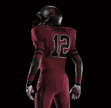
Stanford pro combat pics
Grade: F
Its hard to go wrong with black, red, and white. But they did it. Black and dark red blend into each other so much its hard to read anything on this uniform. It seems they realized that with the numbers and stroked them in white, but why leave the other elements to disappear? The sleeve stripe on the undershirt is cool, and has nice unity with the pants stripe but why black? Why so similar to Georgia? The helmet does no better. Its all just a mess of dark unflattering colors with your eye attracted to the white trim on the numbers which ends up only being an eyesore. This is a perfect example of random re-coloring. There seems to be no reason for these decisions except to do something different enough they can pass it off as a PC uniform and hope if catches because black is a popular color addition. same with the matte helmet which I usually dig, but its not for Stanford.

Ohio State pro combat pics
Grade:: D+
Its hard to judge this one because its based on the 1965 uniforms. Its sort of a throw back, but its not trying to be a total throwback like the 2010 (and 2009?) Pro Combats. Only the helmet and number font are pulled from the ’65 uni and im 99% sure they chose that uniform because it actually featured a helmet with a ridiculously wide stripe which Nike seems to love right now. Unlike back in the day though, the stripe dosnt go all the way down the helmet, it tapers off about 1/3 of the way back.
Then you have this weird solid panel coloring that seems to be colored because it can be. It creates some really odd shapes across the uniform and paired with this tree bark pattern is all kinds of strange. The only element that has any unity across all 3 pieces is the color. Still, theres something to like about the large number font and numbered helmet. No matter what you do with red and silver/grey, I think its going to be perceived as Ohio State.

LSU pro combat pics
Grade: D
In 2009 Nike did the same thing with LSU, made a gold and white uniform. The only thing they did here was replace their athletic yellow with a traditional gold, and make everything else white. I cant help but wonder about adding that 3rd Marti Gras color, green and keeping their purple and yellow. Seems that would be much more appropriate. there is 1 thing that is well done. its the light tiger stripe pattern inside the numbers. why do the others not receive that kind of attention and creativity?
I don’t think there much to say here. What they did is obvious. And the cherry on top is adding that awful pit-stain panel to the jersey. Its like they wanted to stay simple, but do something slightly different, then make sure they screwed it up real nice with the pit-stain jersey.

Michigan State pro combat pics
Grade: F
This has a lot of the same problems as Stanford with the colors and Georgia/Ohio State with the random panel coloring. It dosnt look good when your colors stop and start at unflattering seams with no flow or rhythm. Its blocky and awkward and the low contrast in colors dosnt help. Or maybe it does by hiding it?
The helmet features another one of those fat unflattering stripes. The addition of gold here would be cool if handled with more care and if they left the black out. Adding the gold to their green and white could produce a vibrant, exciting palette to work with and be different enough for the goal of the project. It ends up looking nothing like a Michigan State uniform.

Oregon pro combat pics
Grade: B+
Its strange to see Oregon added to the Pro Combat series because they get new uniforms each year and really kicked off this whole alternate reality uniform thing years ago. You know what they’re about and how they handle the uniforms already. They have their template they stick too, and they alter their school colors (green and yellow) and mix them with neutrals and textures. But if they want to push the Pro Combat series out there I guess they need to lead with their best foot. Especially if their other designs are going to be so terrible. Something needs to carry the 2011 series and that is certainly Oregon.
Since I already knew what to expect from Oregon and they did a great job on the design, I really wanted to give this an A grade. My only problem is the undershirt number. Its not completely practical. A.) I don’t think every player wears an undershirt anyway B.) the number actually gets hidden under the pads/sleeves in a lot of cases. I think that’s a slight craftsmanship issue. Not much you can do about it, the stripes work, but the numbers not so much. Just shouldn’t be there.

Boise State pro combat pics
Grade: D-
It’s a nice design. It was also a nice design last year. They just re-colored the uniform, making everything white and adding a gradient to the undershirt. I guess they’ve straightened out the numbers too, they’re not skewed this year. No thought here, “just make it white.”

Georgia pro combat pics
Grade: F
This ones probably the worst of them all. Red is an intense color, full of energy and commands attention. Its an attention whore. So ofcourse if you make your jersey and pants bright red, its going to be too intense. Random color blocking on the shoulders, strange number font choice, and a very strange helmet stripe that carries through the face mask. Like I said earlier, I don’t mind exploring idea like that, but any CD should be able to see that its an awful idea.
This year, it seems Nike got completely lazy and just did some random re-coloring. I have a suspicion that they may have wanted to do something a lot more conservative this year though and focus on simple designs. If that’s the case they have still failed, most of these designs have awkward color palettes with randomly colored panels that create some very odd shapes across the uniforms.
Their newest ideas i dont mind exploring, but should have been thrown out by the first view of the creative director (like Georgia's helmet stripe). Army and Navy being the exception and i guess we'll give Oregon a pass because everyone knows what they're about, changing the colors and textures on their current template. It seems they ignored the uniforms almost completely and focused heavily on the shoes/cleats. Just look at how many promo shots they have of those. Up to 12 for each school. if that is the focus here, why even do the PC uniforms? I mean besides the money and promotion, you'd hope Nike would go into each project with the mindset that they are doing something special. Thats what makes coming to work worth it every day and working with people who care about what they do.
I do hate to be harsh on the people who worked on this project (Nike and the schools) because im not there to see it through and dont know how it was done exactly, or what their goals are, but this series is so disappointing because it looks like no one here knows what the hell they're doing, had no clear direction, was in a hurry to complete and were relying on their past success to support these lazy, uninspired, terrible designs. (again the exception with Oregon, Navy, and maybe Army)
One other issue I have is with the gloves. They sure do look cool, but they are not very practical. In the promo videos you see the message of a school rallying around this uniform, a sort of “us against the world”. An emphasis on team. Then the player scores a TD and flashes his gloves, which in an actual game would cost the team a penalty. Where is your head here Nike?
Promo videos: nflspinzone.com article here
2010 pro combat article here
A – Exceptional. Design that is creative and unique to the school and perfectly captures the specific culture/brand. Technical craftsmanship is without flaws.
B – Very Good. Design is appealing and captures the school spirit. May be a template, but no mistaking for any other school. Perhaps minor flaws in craftsmanship
C – Passable. Has overlooked some details but still on brand and an appropriate concept. Craftsmanship may be lacking in more than 1 area.
D – Poor. Too off brand, poor design decisions, and/or poor craftsmanship but there is something here to like. May resemble other school(s) or usual standard uniform too closely.
F – Fail. Off brand and bad craftsmanship. Poor design decisions and details overlooked. Not school specific at all.

Navy pro combat pics
Grade: B
This might be my favorite one of the bunch. Its actually a solid design with some thought put into it. It may be hard to tell but those numbers have a drop shadow on them, just like the Navy’s ships. The white/blue/blue combo is reflective of a Navy dress uniform. This could line up in the 2010 series and not feel out of place. It feels like the Navy ship numbers would work best on a grey jersey though and not a dress-uniform look.

Army pro combat pics
Grade: B-
The helmet is unchanged from their usual and the pants are a solid gold, minus the black stripe. The only major change here is the jersey and shoes/socks. The jersey is without the usual colored shoulders and a very nice stencil number font. The undershirt is like Oregon State’s last year featuring stripes around the arms, a nice solution to the modern uniform template when using sleeve stripes. The shoes/socks are meant to resemble combat boots which is cool but looks a bit out of place here. If they were going in that direction why not use the digital camo and have a look like that of battle fatigues? THAT would be a great pro combat uni. The whole thing is fairly well done, but its very similar to their regular uniform, not a good ProCombat choice
Stanford pro combat pics
Grade: F
Its hard to go wrong with black, red, and white. But they did it. Black and dark red blend into each other so much its hard to read anything on this uniform. It seems they realized that with the numbers and stroked them in white, but why leave the other elements to disappear? The sleeve stripe on the undershirt is cool, and has nice unity with the pants stripe but why black? Why so similar to Georgia? The helmet does no better. Its all just a mess of dark unflattering colors with your eye attracted to the white trim on the numbers which ends up only being an eyesore. This is a perfect example of random re-coloring. There seems to be no reason for these decisions except to do something different enough they can pass it off as a PC uniform and hope if catches because black is a popular color addition. same with the matte helmet which I usually dig, but its not for Stanford.

Ohio State pro combat pics
Grade:: D+
Its hard to judge this one because its based on the 1965 uniforms. Its sort of a throw back, but its not trying to be a total throwback like the 2010 (and 2009?) Pro Combats. Only the helmet and number font are pulled from the ’65 uni and im 99% sure they chose that uniform because it actually featured a helmet with a ridiculously wide stripe which Nike seems to love right now. Unlike back in the day though, the stripe dosnt go all the way down the helmet, it tapers off about 1/3 of the way back.
Then you have this weird solid panel coloring that seems to be colored because it can be. It creates some really odd shapes across the uniform and paired with this tree bark pattern is all kinds of strange. The only element that has any unity across all 3 pieces is the color. Still, theres something to like about the large number font and numbered helmet. No matter what you do with red and silver/grey, I think its going to be perceived as Ohio State.

LSU pro combat pics
Grade: D
In 2009 Nike did the same thing with LSU, made a gold and white uniform. The only thing they did here was replace their athletic yellow with a traditional gold, and make everything else white. I cant help but wonder about adding that 3rd Marti Gras color, green and keeping their purple and yellow. Seems that would be much more appropriate. there is 1 thing that is well done. its the light tiger stripe pattern inside the numbers. why do the others not receive that kind of attention and creativity?
I don’t think there much to say here. What they did is obvious. And the cherry on top is adding that awful pit-stain panel to the jersey. Its like they wanted to stay simple, but do something slightly different, then make sure they screwed it up real nice with the pit-stain jersey.

Michigan State pro combat pics
Grade: F
This has a lot of the same problems as Stanford with the colors and Georgia/Ohio State with the random panel coloring. It dosnt look good when your colors stop and start at unflattering seams with no flow or rhythm. Its blocky and awkward and the low contrast in colors dosnt help. Or maybe it does by hiding it?
The helmet features another one of those fat unflattering stripes. The addition of gold here would be cool if handled with more care and if they left the black out. Adding the gold to their green and white could produce a vibrant, exciting palette to work with and be different enough for the goal of the project. It ends up looking nothing like a Michigan State uniform.

Oregon pro combat pics
Grade: B+
Its strange to see Oregon added to the Pro Combat series because they get new uniforms each year and really kicked off this whole alternate reality uniform thing years ago. You know what they’re about and how they handle the uniforms already. They have their template they stick too, and they alter their school colors (green and yellow) and mix them with neutrals and textures. But if they want to push the Pro Combat series out there I guess they need to lead with their best foot. Especially if their other designs are going to be so terrible. Something needs to carry the 2011 series and that is certainly Oregon.
Since I already knew what to expect from Oregon and they did a great job on the design, I really wanted to give this an A grade. My only problem is the undershirt number. Its not completely practical. A.) I don’t think every player wears an undershirt anyway B.) the number actually gets hidden under the pads/sleeves in a lot of cases. I think that’s a slight craftsmanship issue. Not much you can do about it, the stripes work, but the numbers not so much. Just shouldn’t be there.

Boise State pro combat pics
Grade: D-
It’s a nice design. It was also a nice design last year. They just re-colored the uniform, making everything white and adding a gradient to the undershirt. I guess they’ve straightened out the numbers too, they’re not skewed this year. No thought here, “just make it white.”

Georgia pro combat pics
Grade: F
This ones probably the worst of them all. Red is an intense color, full of energy and commands attention. Its an attention whore. So ofcourse if you make your jersey and pants bright red, its going to be too intense. Random color blocking on the shoulders, strange number font choice, and a very strange helmet stripe that carries through the face mask. Like I said earlier, I don’t mind exploring idea like that, but any CD should be able to see that its an awful idea.
August best-sellers at Green Apple

Ever wonder what other Green Apple devotees are reading? Well, here are Green Apple's top ten books if August 2011 (with links to books and eBooks where applicable, just in case you want to actually buy a book from us now).
- Game of Thrones by George RR Martin (paper or eBook: $8.99)
- The Help by Kathryn Stockett (paper, $16.00 or eBook: $9.99)
- Clash of Kings by George RR Martin (paper or eBook: $8.99)
- Lucky Peach, Issue 1 (not really a book; magazine $10.00)
- Giants Coloring and Fun! (paper, $3.99)
- Visit from the Goon Squad by Jennifer Egan (paper, $14.95 or eBook $9.99)
- Hunger Games by Suzanne Collins (paper, $8.99 or eBook $14.99)
- Storm of Swords (paper or eBook: $8.99)
- Go the Fuck to Sleep by Adam Mansbach (hardcover, $14.95)
- Dance with Dragons (hardcover, $35.00 or eBook $14.99)
Tonight at Green Apple: Chef Christy Morgan (Also: Food)
 Nothing to do and no food in the fridge for tonight? Swing by Green Apple at 7PM to catch chef Christy Morgan in a discussion about her new cookbook, Blissful Bites: Vegan Meals That Nourish Mind, Body, and Planet. Morgan shows readers how to make healthy, delicious, animal-product free meals without a lot of effort. And if you don't believe it, come taste it -- Morgan will be bringing samples of her delicious treats for the audience to enjoy as they hear her presentation on the importance of plant-based diets and eating local, organic, seasonal foods, followed by a Q&A. There will likely be enough to go around, but these things can get crowded in our cozy Granny Smith Room-- so if you want to guarantee yourself a seat and some food at the presentation, all you have to do is pre-order the book that you're going to want anway after you taste Morgan's cooking. We'll take pre-orders right up to 6PM.
Platform, Publication and Death

After last week's Zinefest in Golden Gate Park I took a moment to swing by The Great Overland Book Company where this sign (above) made me chuckle aloud... then a moment later I it reminded me of a blub I'd read somewhere a month or two ago, that FOXCONN had picked up the contract for Amazon's new tablet/e-reader thingy... hm. Well, why not? They already assemble and produce The Kindle, and if you've already got the right candidate for a job then you should just go ahead and keep 'em around full time. It just makes good business sense.
You know FOXCONN, right? Personally I'm on the brink of an obsession, largely due to the fact that it is so difficult to glean much concrete information on the company itself. They tend to shun reporters from what I've gathered thus far and it's not hard to imagine why. The location itself sounds like the setting for some bizarre sci-fi novel in translation, a walled compound more akin to a labor camp than a workplace, with a history of worker dispute, deadly accidents and on site suicide (fourteen in 2010). Did you know that prolonged exposure to mercury promotes psychosis, hallucination, delirium and suicidal tendency? What a grim realization to make while downloading a "jazzy" anthology of Garison Keillor curated poetry (selection!).
My love and excitement for the handcrafted publication stoked that day at Zinefest, but the important and foreboding message at the bookshop was an abstract reminder of exactly what the polar opposite can be, and the means behind its production. Funny because one of the zines I picked up, Cabeza by Aaron Kaneshiro featured a Mac's "loading" image incorporated into the background on one page. I'm told that synchronicity is everywhere. Still, how did we ever excessively complicate something so simple as reading a good book?

Mission Street Food, the book
More or less monthly, I review a cookbook for Tablehopper (a weekly email chronicling all things food and drink in SF--you should subscribe). Here's last week's review:
NOTE: The authors dropped by, so you should get a SIGNED one while we have them (never too early to start your holiday shopping?).
Mission Street Food (MSF)--as a restaurant, a movement, whatever--is hard to explain. Mission Street Food--the new book by MSF founders Anthony Myint and Karen Leibowitz--is not.
MSF started in 2008 with Myint and Leibowitz sub-letting a taco truck once a week to serve fusion food and fresh-baked cookies to Mission denizens. The goal was to have fun, not make much money, raise money for charity, and cook. When "the man" shut that down, more or less, the couple rented a run-down Chinese restaurant once a week. Then guest chefs were invited. MSF became twice a week. And the story continues, evolving into a fascinating look at a period in SF food history before crème brulee street carts and pop-up restaurants became ubiquitous.

The book starts with the story of Myint's father, a Chinese refugee from Burma, and how his brief life story illuminated most of the principles for what MSF became: "willfulness, naïveté, resourcefulness, altruism, moral flexibility, putative insanity, and a compulsion to use food efficiently."
The story is both improbable and inspiring. The manic energy of the couple, their adaptability, and their passion comes through in the first-person narrative that comprises the backbone of this book from local publisher McSweeney's. It's a he-said, she-said form that reads smoothly, and it more or less follows the venture's growth, mistakes, foibles, and successes.
There are also some interesting sub-sections: a chapter of MSF's history is told in graphic novel form; a 2-page profile of Sara Miles, director of the Food Pantry at St. Gregory's; and a revealing 3-page aside about the collision of cultures in the kitchen as white hipsters sat alongside Chinese residents and two (or more) cultures shared a kitchen.
Then there's an 80-page section about the food, recipes that are as eclectic as everything else around this project. The recipes are creative and clear, with precise instructions alongside vibrant photos.
Mission Street Food is a beautiful book, too: hefty, colorful, even downright shiny in the right light. At $30, it's pretty reasonable, too.
Introducing the Cahiers Series

Booksellers take great pride and pleasure in introducing readers to books they may otherwise overlook. Sure, we love the latest buzzed-about blockbuster, but there's a special place in our heart for the underdog: the overlooked small press gem, the unjustly neglected classic, the locally produced 'zine.
So while the deservedly hyped Ready Player One is our guaranteed choice for September's "Book of the Month" (more on this in an upcoming post), I want to take a moment to introduce a series of pamphlets published by Sylph Editions in conjunction with the Center for Writers & Translators at the American University of Paris: the Cahiers.
 A page from Cahier 5
The Cahiers Series, totaling sixteen published volumes with another on the way this fall, is aimed at exploring the interstices and intersections between writing and translation. With beautifully illustrated essays (etc.) by noted translators (Richard Pevear and Lydia Davis, for example), poets (Alan Jenkins), and novelists (Laszlo Krasznahorkai and Nobel Laureate Gao Xingjian), the series is off to an exciting start that only seems to be getting better as it goes along.
My favorite cahier, in fact, is the most recently published (no. 16): George Craig's Writing Beckett's Letters. Craig is a contributing editor to the ongoing Letters of Samuel Beckett series published by Cambridge University Press (Volume 2 is due out this fall!), and this cahier provides his meditations on the task of translator, and includes photographs of Beckett's notoriously difficult handwriting--in itself worth the very reasonable price of admission. (Each volume is $15.)
 James Joyce consulted Samuel Beckett, then 22 or 23, on Greek
You can find the Cahiers Series on Sylph Editions' website or in just three bookstores in the U.S., only one of which (ahem) is west of 10th Ave. in NYC. For more information, please visit our website.
2011 CFB Uniform Preview & Critique
Everyone who is excited about schools updating or changing their football uniforms has an opinion to offer, but what I mostly read really lacks in proper critiquing. Im just not interested in reading articles where teams are described as a “downgrade” or “upgrade” or “black for blacks sake” etc. (the exception is this nice article from theSportsDesignblog) So, im combining 2 of my passions in this article in an attempt to offer something more in depth; sports design and design critiques.
But, ill only focus on large or important changes for full time uniforms. No need to involve Florida State just for adding a logo under the collar. I wont get into any Nike Pro Combat stuff now either, ill wait until they’re all revealed and do a separate article on them. I’ll save the one-offs (Notre Dame, Michigan) for another time as well.
A – Exceptional. Design that is unique to the school and/or perfectly captures the specific culture/brand. Technical craftsmanship is without flaws.
B – Very Good. Design is appealing and appropriate. May be a template, but no mistaking for competitors. Perhaps a slight miss on brand and/or minor flaws in craftsmanship
C – Passable. There are issues that need to be addressed in the future, or have overlooked some details. Perhaps a bad branding move, but has a steady foundation.
D – Poor. Too off brand, poor design decisions, and/or poor craftsmanship. Will have to be redone, but there is something worth saving.
F – Fail. Off brand and bad craftsmanship. Poor design decisions and details overlooked.

Arizona State (Nike) more photos
Grade: B
Identity: The trident mark looks great on the helmet (more on that in the brand section below) full of aggression, power, and motion. The numbers are handled well too, I love the gradient on the black uni as it resembles a piece of glowing hot metal. I don’t mind the shoulder stripes, it works well enough and it unique to ASU, but the huge ASU mark on the sleeves is way too much. Its like a fat guy trying to squeeze his way down the isle at the movie theatre. Its just in the damn way and dosnt fit. White helmet is out of place, and theres no reason for 4 helmets here anyway. Its overkill for this team which should focus more on red, black, and yellow rather than an all white “storm trooper” look. You’re re-branding with a focus of getting visually tougher, not setting trends like Oregon.
I love their red and yellow and the black dosnt hurt it. it looks great as accent colors on the all black uniform, which should be used only for night games. When you have an alternate I think you save it for a special occasion as such. It makes the whole experience more special and memorable for everyone and when you get dressed up for a special night what color are you most likely to wear? Black. It’s the color of night and night life, as modern as it is classic. Sophisticated, as it is rebellious and mysterious. If they don’t get carried away with the black and white, it’s a great uniform set.
Brand: Totally off-brand? yes, but that’s the point. They want to change their culture and have added black and a fierce trident (while all but ditching the cartoony mascot Sparky, which is too immature for college sports any way) to dilute the friendly, youthfulness of their red and yellow to appear more mature with a strong dose of bad attitude. I don’t think they’re an Outlaw-archetype, but they sure are trying to appear that way. However if its true that the trident was copied (or even if it resembles too closely) from a Chicago gang, then this whole redesign is a failure. You cant replace that trident with Sparky or the ASU mark and still have this aggression in the aesthetic. It completely falls apart.

Baylor (Nike)
Grade: B+
Identity: For a blend of modern and traditional elements, this fits together really well. The pants stripes are not too out of place like BC’s (see below) because they have the obvious bear claw factor supporting it. it’s a nice design that’s not too ‘in your face’ and gives them something unique. The standard number font and ‘Baylor’ across the chest work so well in contrast with the smooth flowing stripes. Im fairly sure the jersey font is the same as in their monogram logo too, which of course would be the ideal decision but you never know with these designers.
Brand: They’re jumping on some trends here; multiple helmets and pants, an all white option. But its all well done. They’re much more traditional than USF who uses green, white, and gold as well so they don’t get confused. Their logo and typography are solid and un-skewed giving a sense of trust, balance, and tradition but also know they have to be current and have a little bit of excitement. They’ve got something here that can last a long time and still be current and fresh today.

Boston College (UA)
Grade: C+
Identity: A victim of UA’s new pants template* but the stripe coloring is really nice, even something ive used myself on concepts. The 2 tone stripe is just cool, but I don’t think its appropriate as it dosnt carry through out the uniform. Their number font used to be the only element, besides color, that communicated “BC”. Now its standardized and theres nothing else to really carry the identity. So now its all on the colors (which resemble FSU) and helmet, which has been improved with the triple-stripe look. Theres also a stained glass pattern in the white part of the stripe which seems odd, but its subtle enough that it works. Im not sure about the white pants. For a school with such a minimalist look, I think 3 pants options is 1 too many.
Brand: the color palette could easily be confused with Florida State, but the blank gold helmet is the brand hero here which should have a long life. The stained glass texture is something worth exploring in other collateral. The number font can no longer be a strong brand element, and is not something I would have dropped, but maybe altered a bit. But this could be a nice uniform for many years. They still look like a BC football team.

Bowling Green (Addidas)
Grade: D-
Identity: Damn Addidas, who thought this number font was a good idea? Look how the 5 closes up, its almost an 8. You have a respectable 0 and 8 but looks like it belongs to another font family. Terrible tangents and awkward curves all through those numbers. I don’t know whats supposed to happen with the side markings on the jersey, they have such an unflattering flow to them. Those pants stripes don’t follow the muscle structure of the leg and seem to have no sense of direction or clear form at all. They just get “tangled” and twisted as they flow down the leg. The only thing those lines do is make the player look like he has a fat ass. I don’t believe ive seen a worse stripe than that.
For that promo picture is there any wonder why they decided to shoot from the chest up? The upper part of the jersey and helmet is not too bad. Why the stripe flows the way it does I don’t know. I guess because some of the numbers taper off like that, they incorporated it into the helmet. It’s a beautiful color scheme that’s hard to fuck up but Adidas/BG have done a good job if it. The only saving grace here is the wonderful color palette and a nice logo.
Brand: If I were a fan of BG I would be in pain seeing these on the field. I don’t think they’ll be met with a lot of negativity by most, but as a designer I just cant watch. The font is totally their own (as far as I know no one else uses it) so there is brand recognition here, but not positive. “ugh, its that ugly BG font!”. Im sure they’ll change these things soon, so it can only get better from here.

Buffalo (Nike)
Grade: C+
Identity: This set is screaming “Detroit Lions” but I generally don’t have an issue with college teams being similar to pro teams. the number font is much better than the Lions though, it’s a slightly modified block with a nice modern stroking. Id love to see them change their monogram helmet mark to reflect them. Its clashing a bit now. I cant see whats so appealing about those “pit stain” jersey stripes though. Its such a random and awkwardly placed element. It does nothing but take your eye away from what is otherwise a nicely put together design. solid pants dosnt work here. Your numbers have 3 colors in them. You added a silly stripe to the jersey, but you leave the pants solid? They need some kind of rhythm with the jersey.
Brand: They’ve jumped from one outdated modern trend to a current modern trend. If they lose the pit-stain stripes and added something to the pants, it would do wonders for the uniform and give it some longevity. My perception of Buffalo has changed with the uniforms though. They went from looking like a poor high school team to, for the most part, a respectable college squad.

Colorado (Nike)
Grade: B-
Identity: I really liked last years uniforms, they were a modern design and so well done. The color of the helmets very unique and just damn cool. Not matching the pants color I would deduct points there, still there was something oddly appealing about that. Now, the Buffalos have gone back to their 90s uniform. Its quite appropriate, the large bold numbers, stripes, and font carry all the characteristics of the Rockies, but its all a bit heavy for the modern jersey cuts. And the sleeve stripes have no where to go but an abrupt cut off point, but that’s a problem with every stripe like that. So that said, I just think they took a step back when they took a step back into the 90s. I think most will feel like me; you’re torn here. This isn’t a bad design, they did everything by the book and executed as well as they could and now the 2 golds match. Everything besides the sleeve stripes is technically right, I just prefer the other design
Brand: They’ve gone from an exciting modern look with lots of movement (skewed numbers and a charging buffalo on the helmet) to a very traditional, minimalist design. theres no trends or nonsense here, its just a uniform to play football in. I don’t know enough about the Colorado brand to say if it’s a good move or not, but im sure all the old Kordell Stewert fans will appreciate it.

Fresno State (Nike) more photos
Grade: C-
Identity: Another one of Nike’s pit-stain templates. Totally unnecessary for this design and a poor stripe design to begin with. The numbers are nice, the colors work well together. The stripes on the sleeves and side of the pants is absolutely beautiful. I love that fading half-tone look. And it even comes in 2 colors! Id love to incorporate that into some promotional materials. Again, why the pit-stain? Its only a distraction from the rest of the good looking design. the wide helmet stripe is a turn-off though. The green V decal only makes it worse. It just makes the back of the players head look fat and the green is such an eyesore.
Brand: For the most part it’s a solid look. I wished they hadn’t touched the helmet, but its still passable and recognizable for Fresno. Theres a lot to like here but the flaws just bring it down so much. I think this is a school that could take some risk with the color palette. Not in an Oregon sense, but changing the blue or red a bit would really set them apart from all the other red schools.


Hawaii (UA) more photos
Grade: D-
Identity: Hawaii has one of my favorite logos in college sports. If they ever drop that “H” I will be genuinely sad for 1 day. That dosnt mean though, that I want to see all those shapes used in every damn detail of the uniform. UA dosnt care though, they forced the jagged triangles into the jersey stripe, numbers, and word mark on the jersey. Every element is in a boxing match with the other fighting for attention. Its all just way too forced. I don’t mind the all white and all black look here but is this the only team without a 3rd jersey or 2nd helmet? Its begging for a green jersey. Their green is beautiful and unique, not sure if anyone else uses it, but why you wouldn’t have a green jersey is beyond me. Not too bad, but then they turn around.
If the Bowling Green stripes from Addidas wernt bad enough, UA said “hold up; we got something for ya!”. Just look at the dude’s expression in the second picture. If that dosnt say “are you fuckin kidding me?” I don’t know what does. Wow UA, just wow. If not for the amazing logo, id mark it an F
Brand: Theres no confusing these guys for anyone else. Their identity is built on a strong Hawaiian history. The brand story is loud and clear. Its just so disappointing to see a brand with so much potential put in the hands of people who have no clue what to do with it. its hard to get behind a team when they look so ridiculous and don’t feature their strongest color as a jersey option.

Indiana (Addidas)
Grade: C+
Identity: Its nice to see the Hoosiers simplifying their look. Its as if they’re always trying to add more, or coming on late to a trend like last years design. it’s a school who lacks identity. They’ve taken the stripes off the helmet and jersey and for the most part are left with a traditional look in their classic crimson and white, and a great logo on the side of the helmet. It’s a uniform that looks at home in their cleanly designed stadium.
Brand: A lack of brand equity hurts, but that just means they can start building pretty much wherever they want. What they need more than anything is consistency and this is a look that will last generations, but I wouldn’t be surprised if they continue to make small changes over the years, as if they cant decide what they really like or who they really want to be. My main issue right now, is they look very much like Oklahoma.

Kentucky (Nike) more photos
Grade: D
Identity: Heres a white helmet done right. I much prefer the white to blue. I cant really say why, its just a color preference, I don’t think the blue is bad by any means. The word mark across the chest is so good. The same is used on the Basketball uniforms. The more-than-usual kerning suits that typeface perfectly. I would like to see some of that grey in the jersey incorporated in the helmet logo or center stripe. It dosnt look like its used anywhere else, so im not sure of the purpose. This could easily grade out as an A with some small changes but then theres the shoulder pattern.
Brand: This is Nike either not giving a damn or being lazy in research. Or maybe Kentucky just dosnt know any better. But the checkerd pattern can not work for them. It dosnt matter that you did it to honor Secretariat, the public’s association with that pattern goes to Tennessee, their biggest rival. That’s just embarrassing. You can not ignore these perceptions. Im a fan of neither school, but as far as im concerned they have the Vol’s endzone art on their shoulders. That kills the whole thing

Louisiana Lafayette (Russel) more photos
Grade: F
Identity: Adding the FdL pattern to the shoulders sounds like a great idea. The execution here is horrible. It ends up looking like a messy grey-to-red gradient and on the white jersey its even worse. it changes the tone of the red making it look pink.
The number font is very poorly constructed. They opened the kerning a bit so the flourishes wouldn’t clash into the opposite number but that’s no solution at all. Its just a terrible font. The inside curves are way too soft and makes the number looks like a bubble letter intended for children. The wordmark dosnt help matters at all. That is no complimentary design. I don’t think that typeface should be on a jersey anyway. Its just not strong enough. Its too thin. I feel like other word marks make fun of it, being the runt of the litter in college football.
They’re using a totally different font on the helmets. Why the dainty serif? How does that compliment anything in this design? ugh! They have some rythym and unity in the pants with the FdL but still, it’s a bad pattern.
Brand: You know they’re from Louisiana because the FdL says so. Like every Canadian sports team with a maple leaf, its only customary to have a FdL in your identity when you hail from Louisiana. It dosnt make them unique, it makes them like everyone else around them. Theres no strong logo. Theres no unique color. Theres nothing here that is uniquely LL and crafted well, so the whole thing needs to be re-done already.

Maryland (UA) more photos
Grade: B
Identity: UA is doing their best Nike impression here, and doing a damn fine job of it. 2 helmets, 1 with a tortoise shell pattern (which is a bit too bold, it should be very subtle) and another matte black. Both work well with the uniforms but are both gimmicky. They need to have a standard helmet with a logo on it. even the script mark on the shell helmet would suffice. Theres nothing that will out last the trend there. The combination of colors is superb! It just looks like an explosion of the Maryland flag and is very exciting and fresh. It just screams “Maryland football!” definitely my favorite new 2011 look and I think my favorite combination is: black helmet, black jersey, yellow pants but its hard to choose. The jersey’s torso stripes are quite out of place and unnecessary and only further indicate how round-bellied the big guys are. The number font is great, the numbers look like the snout of a snapping turtle in some cases. Im not put off by the gradient and texture within either, its appropiate in this design.
Brand: This is like Nike and Oregon in more ways than one. UA is based in Baltimore, so you know they were going all out for their home team, even if all they did is do their best Nike impression. its not a look that will last long, but that’s okay as long as they keep on top of it and roll with the times. It wont please everyone, but im sure the majority of players and students will be excited for this. The colors are such a great palette full of energy, swag, and attitude. Either way, its not a uni you can easily look away from. To see all 3 colors and patterns in the stands would be wonderful, a great mixture that is unmistakably Maryland. You wouldn’t think that so many colors and patterns could build such a strong identity, but its really great. I want to see ticket stubs, shirts, banners, everything. It be so exciting as a designer to work with all they have.

Nevada (Nike)
Grade: C-
Identity: It’s a Nike template anyone can order but it fits Nevada ok. The sleeve stripes shouldn’t be there, theres a clashing of movement with the side/front stripes. I do love how they carried the silver through out the elements though. That trim gives everything a bit of a higher visual value. The helmet logo is poorly drawn, I think that’s what they should focus on rather than re-designing the uniform. That is one of my favorite number fonts though with the matching word mark.
Brand: The logo is so bad they just look like a high school team. This template dosnt help much either. Nice purple color, but a totally forgettable brand that will be redoing their uniform design again in the near future.

North Carolina State (Addidas)
Grade: D
Identity: Just not enough thought put into this. And that’s not a knock against minimalism, NOT doing something is as much of a design decision as doing anything. But NC State needs more. They’re just blending in with Nebraska and Wisconsin and all the other red/white teams. its timeless but its not a strong identity because theres nothing specifically Wolfpack about it.
Brand: Looking at the photo, could you tell what school this was instantly? I don’t believe NC State is a strong enough brand to pull off the “State” jersey. Theres nothing else here that communicates NC State and red and white is certainly not a unique enough palette either. If I say “red and white” how many schools do you think of before you get to NC State? (im around 4) This is a school that lacks personality and is totally forgettable. I always say “the difference between simple and boring is simple is effective”. I think this is boring.

Oklahoma State (Nike) more photos
Grade: B-
Identity: Talk about a trend rider. 3 helmets (2 of them in matte), 4 jerseys, and 3 pants, all in the Pro Combat template. grey helmets are exploding onto the football scene and they’re carrying one too. I would expect a skewed number font. The OSU mark is skewed, and theres so much energy and motion is this palette those numbers need to “move”.
The best part is how Nike has treated the sleeve stripe. Because of modern day cuts, sleeve stripes are more like single shoulder elements anyway, so that’s what they’ve done here. A great solution, taking the stripe and making it work for the new jersey. Its something that works in any space and can be a strong brand element. The “spur” locks it into place visually, giving it a nice home on the shoulder. Its reminiscent of old western wood cut type, but the problem is these cowboys don’t use those types of fonts in their identity. Adding those small “spurs” to the Cowboys mark and OSU mark would tie it all together very nicely. my favorite combo is grey/orange/grey.
Brand: For some schools its no longer about having 1 helmet as a brand hero with icon status, its about using all your colors and making each game unique. if they plan to ride the trend to the end then change again, I can live with that. They’ll have to though, this isn’t something that will last for more than a hand full of years. It should get their fan base excited for this season, they could almost wear a different uniform in each game. It’s a dramatic difference from what they’ve had so it will be met with some negative responses but I think over all, it’s a good move for 2011. I would recommend staying away from too much black and orange, as its way too close to Oregon State.


Purdue (Nike)
Grade: A-
Identity: This seems like change for the sake of change. their old uniform was traditional but not outdated by any means. They’ve gone to a full-on modern feel now. Nothing is out of place here, they can actually pull off the solid pants, but id love to see a hip logo or a small single stripe down the leg for better color balance and to match the helmet. I love the number font which is not too trendy and helmet which now has a single stripe. Its also painted in a beautiful gold.
Brand: They’ve just gone from traditional to modern. It feels like a steady evolution that wont upset anyone. There was no real reason to change, but im not mad at them for doing so either. I think they made the helmet even better. They managed to keep all the brand equity and all that makes Purdue important.

South Carolina (UA) more photos
Grade: D+
Identity: I really like their solid color looks. All white, all black, or all red. The numbers and word mark are strong and work well together. The striping all over the uniform is spastic and odd. I just have more questions than anything else. I cant figure out why the inside jersey stripe is missing where is connects to the shoulder. UA just cut that little piece out. the pants stripes don’t match at all, theres thin weird stripes on the back of the jersey, and the helmet has traditional stripes down the center. Its just all over the place, with no unity or consistency at all.
Brand: Theres nothing gaudy about the uniform that the fans will be turned off by, but its those little details that kill UA in so many of their designs. Especially here, its just like they pick random shit to throw at the uniform and roll with it.

South Florida (UA)
Grade: C+
Identity: 3 helmets is 2 too many here. if the logo were a solid color it would be great and would work better in all their combinations. I love white helmets but not for them. With a modern styled logo, a white helmet just looks unfinished to me. Its usually best for simple, solid designs (Colts, Jets, Miami U, Texas). Same to be said with ASU’s white helmet. Why the addition of the stripes to the white helmet? If they did it there, why not in the white pants too? Maybe they thought the same as I do, “it looks unfinished on white, lets add a stripe”. That was totally unnecessary though. the jersey stripes are really clunky and awkward to me. They taper in the wrong direction, moving your eye down. at least with South Carolina they taper up and have an upward motion. Its an UA thing though, they seem to love it. I do dig the gold/green/green combo.
Brand: Theres nothing that has changed the brand archetype or that would get the fan base in a riot. Its still USF, green and gold, and something they’ll be proud of. That logo is one of the better ones in sports, it just needs the strokes eliminated.

Texas Tech (UA)
Grade: D
Identity: The white jersey has a 2 color stripe but only 1 color on the black and red jerseys. Where the attention to detail? And if they did it on purpose, it’s a bad choice. Stroking the word mark only makes that bad typography clash into each other even more. Heres a team that uses a heavy slab-serif in their logo and sports this strange number font (is it Marylands?). completely out of sync. They also are using a “butt hat” design on the pants. Even if that were acceptable, im not sure “Guns Up” is.
Brand: They’ve never had great uniforms, and this is just another subpar design to add to the history. Everything they wear is just ugly. They try to pull off an edgy, aggressive look with pointy numbers and a lot of black, which could work but so far in their history has always looked cheap due to poor design. they need help and UA isn’t doing them any favors, but they arnt helping themselves either if the school is involved in any design decisions.

Washington State (Nike) more photos
Grade: A-
Identity: Grey helmets are growing in popularity but for WS it works well, as their colors are red and grey. They didn’t just re-brand the football team here, like ASU, they got everyone involved. I don’t think any helmet is great. The grey ones need a red face mask for better color balance and the red one just screams Oklahoma. If anything, THAT’S the one that needs the grey mask. I never liked this style of jersey shoulder stripe either. Personally, I think it looks odd in any color scheme. It dosnt connect to anything and crowds the numbers space. I do love the typography, the school name spelled out looks nice and is different from the norm. its nice to see the whole name used and not a large over bearing “STATE” on the chest. Everything has a nice rhythm and unity from the 3 football unis to the matching alternate sports uniforms. My favorite combo is grey with red logo/red/dark grey.
Brand: They’ve added a lot of consistency to this brand. all the sports uniforms look similar and the use of grey has strengthened the whole identity. They look modern and cutting edge without being too trendy. It’s a school that wants to compete for championships and be respectable. They’re not there yet program wise, but they look like they belong.

Wyoming (Nike) more photos
Grade: D+
Identity: I love the youthful and rugged color palette of Wyo. Perfect colors for the area and history. So im glad they decided to use a lot of brown and yellow. Having 2 white helmets is unnecessary. You have to be able to choose one between the two. Its ridiculous to have that little variation if you’re going with multiple lids. The brown logo works best but dosnt need the stroke. The matte brown helmet is kick ass but I think they missed on the logo. It would look great in yellow there. More schizophrenia in the jersey department, all 3 use a different template, even the pit-stain template on the road jersey. Theres also 2 diferent pant templates. My favorite combo is brown/yellow/brown.
Brand: Theres got to be some consistency somewhere and its like Wyoming did all the could do to avoid it. the only thing consistent is the number font and logo, but it changes colors. Somebody needed to make some decisions about who they wanted to be here, but its like they missed out on all the trends the last 2 years so they’re making up for all of them this year. If its Nikes doing, then shame on them too. Beautiful colors, great logo, but nothing matches.
. . . . . . . . . . . . . . . . . . . . . . . . . . . .

* Under Armour’s new pants: They’re using a new pant template which cuts off the bottom of the pants stripe at an angle at the knee. That’s where a seam is running up the leg and the color ends at that seem. It creates a terrible tangent with the stripe’s point right on the base of the pant leg. Its not so bad for those like BC because of the duel stripe, but if you have a solid or 3 stripe look (Auburn), the tangent is far worse. Terrible decision by UA with that. They tried to give the pants an element that would be instantly recognizable as their design like Nike did with the Pro Combat. But, Nike obviously understands design principals better than UA, at least when it comes to the pants department. Nike’s PC stripe is cut at the top on the thigh, so their stripes are roughly in the golden-ratio range and being cut at the thigh donst look as strange as having a small corner removed at the base of the pants.

* The “butt hat” or “tramp stamp” mark is as it sounds. It’s some sort of mark or typography on the back of the pants along the belt line. I for one like the look of a clever phrase along the belt line but I would never actually use it on a design. Because no matter how cool it looks, theres always that negative connotation with stupid girls getting dumb, meaningless butt decorations. As a designer, you can not ignore these things.

Southern Miss: This helmet is too damn cool to leave out. not sure how the uniforms will look yet.
Subscribe to:
Posts (Atom)