“Good design is invisible”
Graphic Language: What is Design?
“Good design is invisible”
Well, that’s a boring ass way of looking at a visual art. . . I’ve heard that quote many times but don’t know what dork said it. Probably a web developer or industrial designer :) Definitely not someone who makes logos, posters, product packaging, book covers, or street art.
Design is many things and to try to make it one thing is silly. That quote dosen’t touch all the things that design is, but I get it. It touches things like street signage. Usually in every town and city in America you go to the street signs are green with white Helvetica type. They serve an information purpose and are designed to communicate that info quickly and efficiently. That kind of design is invisible to the extent you don’t think much about it and it is accepted as a natural part of the environment. It causes no harm and does nothing to make you take notice of the things it’s doing wrong, or ruining your experience of driving. That kind of design does not have the same principles as a movie poster or sports car.
Design is graphic art, information, language, communication, technology, a chair, an engine, a plan, an idea, a dream. It’s emotional, or it’s not. It takes a long time to do, or it’s done in a minute. Design is so much more than a single quote. It’s a creation with a purpose, if only the purpose it to create something. I can’t explain it any better than that.
Graphic Language: Application & Environment
As graphic designers, we design things for other things. Logos for websites, graphics for packaging, type for posters. What we do goes on something else and whatever that something is has to be considered in the design process. It’s not enough to design something that communicates the right messages and looks good on paper or in Illustrator, it needs to do all that on whatever it’s going on to. This is the importance of graphic application.
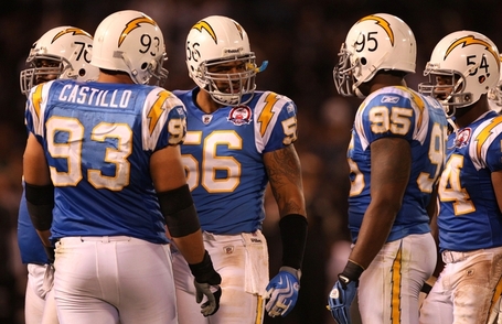
Think of a football helmet. It’s contours, ridges, and obstacles (ear holes, vents and bumpers) have to be considered when designing something to go on it. A good example is the Sand Diego Charger’s logo. The lightning bolt was designed specifically for its shape and lines to form perfectly to the helmet.
The next step is to consider the environment in which your design will live. That thing you designed for that other thing is going to be viewed on or in another thing or place. Think of a billboard, and is it surrounded by trees or buildings? Is it in a climate that experiences all seasons or just the good one (summer)? Is the label on that bottle going to be seen along with 100 others on a shelf or just 10? How’s the lighting? All things to be considered when choosing type, color, material, etc.
Subscribe to:
Posts (Atom)


