
As graphic designers, we design things for other things. Logos for websites, graphics for packaging, type for posters. What we do goes on something else and whatever that something is has to be considered in the design process. It’s not enough to design something that communicates the right messages and looks good on paper or in Illustrator, it needs to do all that on whatever it’s going on to. This is the importance of graphic application.
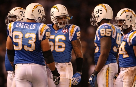
Think of a football helmet. It’s contours, ridges, and obstacles (ear holes, vents and bumpers) have to be considered when designing something to go on it. A good example is the Sand Diego Charger’s logo. The lightning bolt was designed specifically for its shape and lines to form perfectly to the helmet.
The next step is to consider the environment in which your design will live. That thing you designed for that other thing is going to be viewed on or in another thing or place. Think of a billboard, and is it surrounded by trees or buildings? Is it in a climate that experiences all seasons or just the good one (summer)? Is the label on that bottle going to be seen along with 100 others on a shelf or just 10? How’s the lighting? All things to be considered when choosing type, color, material, etc.
