This year, it seems Nike got completely lazy and just did some random re-coloring. I have a suspicion that they may have wanted to do something a lot more conservative this year though and focus on simple designs. If that’s the case they have still failed, most of these designs have awkward color palettes with randomly colored panels that create some very odd shapes across the uniforms.
Their newest ideas i dont mind exploring, but should have been thrown out by the first view of the creative director (like Georgia's helmet stripe). Army and Navy being the exception and i guess we'll give Oregon a pass because everyone knows what they're about, changing the colors and textures on their current template. It seems they ignored the uniforms almost completely and focused heavily on the shoes/cleats. Just look at how many promo shots they have of those. Up to 12 for each school. if that is the focus here, why even do the PC uniforms? I mean besides the money and promotion, you'd hope Nike would go into each project with the mindset that they are doing something special. Thats what makes coming to work worth it every day and working with people who care about what they do.
I do hate to be harsh on the people who worked on this project (Nike and the schools) because im not there to see it through and dont know how it was done exactly, or what their goals are, but this series is so disappointing because it looks like no one here knows what the hell they're doing, had no clear direction, was in a hurry to complete and were relying on their past success to support these lazy, uninspired, terrible designs. (again the exception with Oregon, Navy, and maybe Army)
One other issue I have is with the gloves. They sure do look cool, but they are not very practical. In the promo videos you see the message of a school rallying around this uniform, a sort of “us against the world”. An emphasis on team. Then the player scores a TD and flashes his gloves, which in an actual game would cost the team a penalty. Where is your head here Nike?
Promo videos: nflspinzone.com article here
2010 pro combat article here
A – Exceptional. Design that is creative and unique to the school and perfectly captures the specific culture/brand. Technical craftsmanship is without flaws.
B – Very Good. Design is appealing and captures the school spirit. May be a template, but no mistaking for any other school. Perhaps minor flaws in craftsmanship
C – Passable. Has overlooked some details but still on brand and an appropriate concept. Craftsmanship may be lacking in more than 1 area.
D – Poor. Too off brand, poor design decisions, and/or poor craftsmanship but there is something here to like. May resemble other school(s) or usual standard uniform too closely.
F – Fail. Off brand and bad craftsmanship. Poor design decisions and details overlooked. Not school specific at all.

Navy pro combat pics
Grade: B
This might be my favorite one of the bunch. Its actually a solid design with some thought put into it. It may be hard to tell but those numbers have a drop shadow on them, just like the Navy’s ships. The white/blue/blue combo is reflective of a Navy dress uniform. This could line up in the 2010 series and not feel out of place. It feels like the Navy ship numbers would work best on a grey jersey though and not a dress-uniform look.

Army pro combat pics
Grade: B-
The helmet is unchanged from their usual and the pants are a solid gold, minus the black stripe. The only major change here is the jersey and shoes/socks. The jersey is without the usual colored shoulders and a very nice stencil number font. The undershirt is like Oregon State’s last year featuring stripes around the arms, a nice solution to the modern uniform template when using sleeve stripes. The shoes/socks are meant to resemble combat boots which is cool but looks a bit out of place here. If they were going in that direction why not use the digital camo and have a look like that of battle fatigues? THAT would be a great pro combat uni. The whole thing is fairly well done, but its very similar to their regular uniform, not a good ProCombat choice
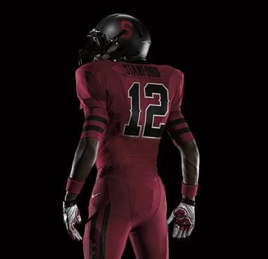
Stanford pro combat pics
Grade: F
Its hard to go wrong with black, red, and white. But they did it. Black and dark red blend into each other so much its hard to read anything on this uniform. It seems they realized that with the numbers and stroked them in white, but why leave the other elements to disappear? The sleeve stripe on the undershirt is cool, and has nice unity with the pants stripe but why black? Why so similar to Georgia? The helmet does no better. Its all just a mess of dark unflattering colors with your eye attracted to the white trim on the numbers which ends up only being an eyesore. This is a perfect example of random re-coloring. There seems to be no reason for these decisions except to do something different enough they can pass it off as a PC uniform and hope if catches because black is a popular color addition. same with the matte helmet which I usually dig, but its not for Stanford.

Ohio State pro combat pics
Grade:: D+
Its hard to judge this one because its based on the 1965 uniforms. Its sort of a throw back, but its not trying to be a total throwback like the 2010 (and 2009?) Pro Combats. Only the helmet and number font are pulled from the ’65 uni and im 99% sure they chose that uniform because it actually featured a helmet with a ridiculously wide stripe which Nike seems to love right now. Unlike back in the day though, the stripe dosnt go all the way down the helmet, it tapers off about 1/3 of the way back.
Then you have this weird solid panel coloring that seems to be colored because it can be. It creates some really odd shapes across the uniform and paired with this tree bark pattern is all kinds of strange. The only element that has any unity across all 3 pieces is the color. Still, theres something to like about the large number font and numbered helmet. No matter what you do with red and silver/grey, I think its going to be perceived as Ohio State.

LSU pro combat pics
Grade: D
In 2009 Nike did the same thing with LSU, made a gold and white uniform. The only thing they did here was replace their athletic yellow with a traditional gold, and make everything else white. I cant help but wonder about adding that 3rd Marti Gras color, green and keeping their purple and yellow. Seems that would be much more appropriate. there is 1 thing that is well done. its the light tiger stripe pattern inside the numbers. why do the others not receive that kind of attention and creativity?
I don’t think there much to say here. What they did is obvious. And the cherry on top is adding that awful pit-stain panel to the jersey. Its like they wanted to stay simple, but do something slightly different, then make sure they screwed it up real nice with the pit-stain jersey.

Michigan State pro combat pics
Grade: F
This has a lot of the same problems as Stanford with the colors and Georgia/Ohio State with the random panel coloring. It dosnt look good when your colors stop and start at unflattering seams with no flow or rhythm. Its blocky and awkward and the low contrast in colors dosnt help. Or maybe it does by hiding it?
The helmet features another one of those fat unflattering stripes. The addition of gold here would be cool if handled with more care and if they left the black out. Adding the gold to their green and white could produce a vibrant, exciting palette to work with and be different enough for the goal of the project. It ends up looking nothing like a Michigan State uniform.

Oregon pro combat pics
Grade: B+
Its strange to see Oregon added to the Pro Combat series because they get new uniforms each year and really kicked off this whole alternate reality uniform thing years ago. You know what they’re about and how they handle the uniforms already. They have their template they stick too, and they alter their school colors (green and yellow) and mix them with neutrals and textures. But if they want to push the Pro Combat series out there I guess they need to lead with their best foot. Especially if their other designs are going to be so terrible. Something needs to carry the 2011 series and that is certainly Oregon.
Since I already knew what to expect from Oregon and they did a great job on the design, I really wanted to give this an A grade. My only problem is the undershirt number. Its not completely practical. A.) I don’t think every player wears an undershirt anyway B.) the number actually gets hidden under the pads/sleeves in a lot of cases. I think that’s a slight craftsmanship issue. Not much you can do about it, the stripes work, but the numbers not so much. Just shouldn’t be there.

Boise State pro combat pics
Grade: D-
It’s a nice design. It was also a nice design last year. They just re-colored the uniform, making everything white and adding a gradient to the undershirt. I guess they’ve straightened out the numbers too, they’re not skewed this year. No thought here, “just make it white.”

Georgia pro combat pics
Grade: F
This ones probably the worst of them all. Red is an intense color, full of energy and commands attention. Its an attention whore. So ofcourse if you make your jersey and pants bright red, its going to be too intense. Random color blocking on the shoulders, strange number font choice, and a very strange helmet stripe that carries through the face mask. Like I said earlier, I don’t mind exploring idea like that, but any CD should be able to see that its an awful idea.